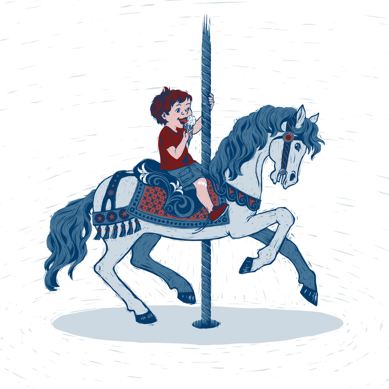
New Piece! I didn't get my typical process images this time... but I did take a video! I'm learning new things 😊. I have to say, though, that the video doesn't quite go to the very end of the process... it was getting long, and I didn't want to have a crazy long video, so... yeah. It shows most of it though. As you see above, I ended up going with an accent color--while I like the monochrome, I wanted a little more to it. In the past, my layers have been created as if they were separate "blocks" of a linocut. This time, the layers are assembled as if they were a reduction print... this is how they come together: I even nudges a couple of the layers a bit, as if the registration was a little bit off... I want to experiment more with that in the future. Maybe its something that nobody but me appreciates, but *I* think it's cool ;-) .
0 Comments
Finally.... I got my three rainstorm sketches finished! Huzzah! The real trick here was trying to make the character consistent in each. It isn't perfect, but I think I did it. The expression is different in each one, but I think the main facial proportions are consistent. This character features in a dummy book I'm working on, but these illustrations probably won't make it into the final story. These were just an exploration of the character and style for the book. Its funny how, when I was sketching this character, I tried many different looks--straight hair, curly hair, long hair, short hair, dark skin, medium skin, light skin. But there was a look I kept coming back to that just felt right. Somehow, she ended up looking a lot like my little girl--plus a few years. She just needs to be blonde :-). I guess it makes sense that she's the one I'd draw, since I look at her every day. And its funny that after these sketches were already done, we had a few rainy days here. We put on her rubber boots and went out with her, and she had just as much fun splashing in the puddles and looking around at the wet world as I drew her doing here. Its so great to experience new things through a kid's eyes. Here is how the final piece (the middle one) progressed to finish. I always think it's interesting to see how an illustration looked at the beginning. Remember this? Well, I finally got around to finalizing one of my other sketches of this character. Keeping a character and style consistent is harder than it might seem! Especially since there were months between when I did these. I am catching tiny things to tweak even as I post this... so there will probably be updated versions of these in the future, when I get the last one done and I can edit all three side-by side. I hope to get the third image done soon... ish. Because life with a newborn makes getting things done... slow. And unpredictable. But very very satisfying. Happy New Year! Time flies, doesn’t it? So much happened this year! But for me, illustrating a lot wasn’t one of them. Going back and making a count, I only completed seven illustrations this year. Thats IT. And that includes this one. Time for tea! I wasn't quite as diligent at saving progress of the image as usual--though I did take a few quick snapshots and put them on Instagram as I worked. I really like having a nice progress slide show at the end, though, so next time I'll have to remember better. ![]() I’m mostly pleased with how it came out. I’m glad I took the time to push through and get one more illustration done. I call myself an illustrator after all. For that to be true, I gotta, well… illustrate. So, WHY didn’t I get much illustrating done this year? After all, a year is a long time. It’s 12 whole months… 52 weeks...365 days… plenty of time to draw, right? Plenty of time, yes. But that means it's hard to hold it all in your head at once. For example, this time last year we didn’t know we’d be moving in a few months--it was still a big “maybe-but-probably-not”. And, while I’m being honest, I’ll just add that we also weren’t planning on adding to our family quite yet. Toddler, house hunting, moving, pregnancy… that has been my year, and the toddler was the only one of those I saw coming. So many things I THOUGHT I was going to get done this year… kind of got pushed aside. For example, this is the SECOND time I said, “I’m going to do a real postcard campaign, like a real illustrator, for real! See, I’m sending out a real postcard!” ...only to find out that I was pregnant a couple weeks after sending out the first card. Again. Which of course led to a lot of stopping and thinking and deciding (again)… this is not the right time for this after all. (It might have been nice to figure that out before sending out the card, but, well… life, amirite?) So I’m approaching goals a bit differently this year. I still believe setting goals is a good thing. However, based on my experience, as well as a lot reading and research I’ve been doing lately, I believe that setting goals for an entire year is just too much. Next December is just too far away right now for me to set a super specific goal--too much is going to happen between now and then. Of course there are always exceptions to this, but in general, yearly goals slip away from me (and most people) too easily. So from now on, my specific goals will be done monthly and quarterly. So, this quarter, Jan-Feb-March, my goal is this: have a baby and figure out being a mom of two, at least a little bit. I also want to get more MG/YA appropriate images in my portfolio, and nursing is GREAT reading time, so I will be reading some fun MG/YA while I’m stuck (happily) under an eating/sleeping/pooping baby. (Speaking of--if you have recommendations for great MG/YA novels that have been published in the last few years, let me know in the comments! I have a bunch of great recommendations from friends on Facebook but more can’t be a bad thing.) Looks like not much illustrating will be done this quarter… but I am OK with that. We’ll see where we're at next quarter. Thats it. I have some very basic, general goals in mind for later quarters of the year, but we’ll deal with those as we get closer--they will probably change anyway. Here I come, 2018. Theres someone I'd like you to meet--or should I say, someones. These are the friendly monsters! (If you follow my instagram, you've already met them :-) They star in my latest picture book dummy. This is one of those ideas that hit at 4am (I was up thanks to a hungry baby) and just WOULDN'T LEAVE ME ALONE until I put it on paper. I jotted down a few lines and then was finally able to get a bit of sleep. The first draft came out pretty easily. I let it sit, did some edits, and then I sent it off to a few different friends (and the 12x12 community) to get feedback. I love having different places to get feedback from, because I feel that when I just get it from one critique group they hear the first person's comments and then everyone just ends up agreeing with that person--not always, but fairly frequently. I like having different places to get feedback so people are thinking up their comments independently--I feel they're more helpful that way. I don't know where I first heard this thought on critique, but its something I generally live by: If one person tells you something, its an opinion and you can ignore it if you choose. If two or more tell you independently that it is a problem (not just critique group partners chiming in, people critiquing who don't have any access to the comments of the other) then it is something you need to take a look at. In the case of this story, having multiple critiques... didn't backfire, per se, but it did give me directly contradicting advice. From one friend, "There is too much X! I think you should take out X completely." From another "The X is nice, but I think you need even MORE X." Oh, the joys of navigating critiques. I've at least got plenty to think about with this story, and I'll do my best to be true to what I loved about that idea at 4am. As far as the art goes, I'm trying a slightly different style here, and LOVING it. Seriously, why didn't I try working this way before! I'm still using my cutaway linocut vector process, but really minimizing the linework. Instead of starting with the lines and then filling in the shapes and colors, I'm starting with the big shapes and adding lines only where necessary to define the form. I'm using the shadow layer to create texture instead of the line layer as I usually do. I really like how it came out. I think I'll definitely still do linework-based illustrations, but I want to do more of this approach as well. As usual, progress images of how this one came together. What do you think? I said I'd do it, and I did. Earlier today, I submitted the dummy of my story FINN'S FEET to the Little, Brown Emerging Artist Award. Thanks to all who commented on my last entry to help me find a title. Now my little story is going off into the world... It was a big project, and the housework definitely got neglected as the deadline got closer, but it's done. It feels so good! I only saved progress images of one of the illustrations, though. I was just trying to get them done as quickly as I could, so saving out periodically as I usually do just didn't happen. This is a good start for my goals this year of pushing forward with my writing and illustrating this year, and actually submitting my work as well. Before doing this project I thought I mostly wanted to illustrate other people's stories, but putting this together helped me to realize that I actually really like creating my own stories too. I will definitely be doing more! So awhile back I did a master copy of a piece by Norman Rockwell. Because, well, Norman Rockwell. Also, master copies are good practice. So after doing that one, of course I had to do one by Rockwell's hero, J. C. Leyendecker. Thats right. Rockwell was a young artist with dreams and heroes once too! And one of his big inspirations was Leyendecker, who was doing Post covers long before Rockwell was. His have a different design sense than Rockwell's certainly, but his humorous scenes I think inspired Rockwell, who took that concept and perfected it. I started this master copy in mid November. Yes, November. Then life happened and it got set aside for awhile, then picked up again, then set aside... so three months later I'm posting it, not because I think its perfect, but because I'm kind of sick of it. I wasn't as strict with myself with this one as I was with the Rockwell copy I did. I did have a few layers (maybe 5 in the end, I think) and I took advantage of some of Photoshop's awesome tools such as Liquefy and Transform to try and get my drawing just right. It still isn't just right, but I don't think I did half bad. One thing I really learned from this is that I need to learn more about how to create and manipulate Photoshop brushes. This was really made clear to me because to me, Leyendecker is ALL ABOUT the brushwork. The man was a master. So I look at his piece with all it's beautiful brush strokes and I try to imitate them in Photoshop and get frustrated because I'm not even close. I know Photoshop can't imitate brush strokes perfectly, but I know it can do a whole lot better than I'm currently getting it to do. Next thing to focus on, I guess. As always, I saved periodically as I worked. Wow, my drawing was WAY off in the beginning! Photoshop makes it much easier to get it right--well, closer to right. Anyway, I think I learned what I needed to learn here and I'm excited to move on from this project. So one of my goals last year was to put together a portfolio I wouldn't be shy to show to people and actually advertise. I completed that goal, and I've continued to make new portfolio pieces this year as well (though pregnancy has slowed that down somewhat.) I like what I have in my portfolio. But the entire thing is done completely in Illustrator, and while I love the textures and happy accidents I've been able to incorporate into such a digital-looking program, I feel like I'm really leaning on what is familiar. That isn't a bad thing, but I really want to get another set of quality images created--using Photoshop rather than Illustrator. That is the goal for this year. (And maybe next year, seeing as how the other goal for this year is to birth a baby and, you know, keep it alive and not go crazy.) Awhile back the extremely popular digital artist Loish ran a kickstarter campaign which I supported. One of the rewards I received for backing was a video tutorial showing her process of painting a character in Photoshop. I watched it and felt that I really got a lot out of it. I especially liked the way her color scheme is kind of found organically through the process of painting, by using different color tools at various points in the process. So I decided to do a quick character painting in Photoshop to try out some of her methods. Digital painting is still something I'm really insecure in, but I believe that some of Loish's tricks and methods are definitely going to find their way into my digital painting process. I especially love how she uses an unusual color for her drawing lines and uses that to choose colors she adds later. Her colorful outlines make me think of a Wayne Thiebaud painting, whose work I also love. This only represents a few hours of work and I certainly don't feel like it is portfolio quality yet. However I feel like it was a great learning piece and it was a great opportunity to try out Loish's technique. I'm so glad I supported her kickstarter campaign! Since I was in unfamiliar Photoshop territory, I went for a familiar character. I have no idea how many times I've drawn Attolia, but she has kind of become a default for me. I imagine this as being from a specific scene in The Queen of Attolia by Megan Whalen Turner. If you can guess which one you get a gold star ;-) Pregnancy is weird. One of the best and worst parts of it is when the baby kicks. Best because, well, it confirms that your baby is alive, first of all, and also it feels kinda cool. Worst because, well, ouch. It doesn't always hurt. But sometimes baby chooses just the right place, or sometimes chooses one place to kick over and over and over and over. Seriously, baby? You have a whole uterus! Find somewhere else to bruise! I've mostly seen sort of nice-sounding descriptions of what a moving baby feels like inside you. "Flutters" or "popcorn" or "tickles" or "bubbles" or "a fish swimming inside you." Ok, I see that. But really, it feels like my intestines are spasming, or even having a seizure when she decides to go REALLY crazy for a bit. Or, hows this for a description... imagine that there is a tiny human inside of you that is moving and jerking around. THATS what it feels like. As I said, usually it feels really cool. But I can probably be forgiven for daydreaming about other ways a baby could arrive at those times when she chooses to kick the same spot over and over and over. Is anyone else entertained by seeing the progression of a piece, or is it just me? Anyway, I like it, so I'll put it here for me if not for anyone else. I made this piece months ago, but I just realized that I never posted it on my blog. Oops! I created a piece for the SVS Third Thursday competition, responding to the prompt, "None of the animals could believe their eyes. The aircraft worked! For the first time Ostrich was actually flying!" I got a bit of feedback on my original idea here: http://forum.svslearn.com/topic/439/third-thursday-start And then created my piece. This is what I turned in for the competition: And, while it didn't win a free class, it DID win a critique (what I was really after anyway ;-). You can watch the critique here, starting at about 51:44: And this is the edited version I made based on the critique I received. I chose which corrections I felt were most interesting while also do-able in a reasonable amount of time. Obviously, when not working with an Art Director its up to me to decide how to best make corrections, as well as how much time I want to put in before calling it done. I agree with the suggestion that adjusting the gestures of ALL the animals would be helpful, but would require soooo much re-drawing and ultimately would just be putting more into this piece than I personally feel would be helpful. That would have been a correction best made in the sketching stage I think. I do feel that the piece is much improved now. |
Your email will not be shared with anyone. It will only be used for updates from me, and you can unsubscribe at any time.
Want a Print?
Take a look at my print shop on INPRNT.com Categories
All
Archives
September 2020
|