I've always loved to see how my favorite artists have developed their skill and style over time. The hashtags #drawthisagain or #drawthisagainmeme have lots of fun examples of artists who revisit the same subject matter as they did in the past and show the two versions side by side. I never did it before... but that is about to change! When the idea of this image first came to me, it stuck in my head and wouldn't leave. This happens every once in awhile. Usually, drawing it out gets it out and thats it. I tried just putting it in my sketchbook, but that wasn't enough. I was in college at the time. and was luckily in a class where we had a lot of freedom in choosing what we would paint for our assignments... which was just the excuse I needed. 
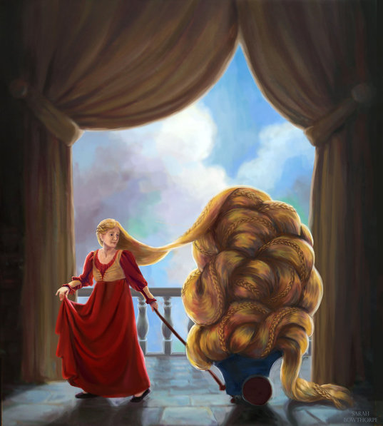
Honestly... I wasn't thrilled with it came out (and, of course, am even less so now). Despite trying multiple thumbnails, getting detailed reference with my roommate posing in costume (Thanks, Annilynski) and doing everything I knew how to do, it just turned out OK. But, I was just a student. Giving it a good try was all I could do, and I did learn a lot from it. Fast forward a couple years. I had graduated and worked in-house at Cricut for a few months before moving across the country with my husband. I was working from home, experimenting with my process and style and expanding my portfolio. What to draw? This idea jumped to mind--I wasn't satisfied with my last attempt, why not give it another go in an entirely new style? So I did. 
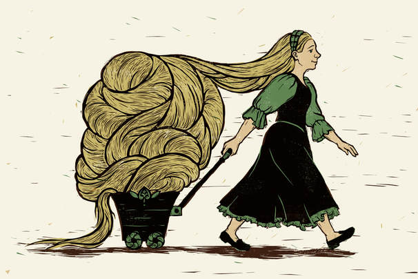
I liked it much better. I felt that the more graphic style was really working for me, and it had a bit more movement than the previous version. Fast forward to now, a few years later again. I have been experimenting and developing my style more and found myself wanting to try this image yet again. Now with kids of my own, I found it easier to make Rapunzel look younger as I had always wanted. Its not as graphic as my second, not as modeled/realistic as my first. And I still don't love it, but it is an interesting addition to this series. I think I may have to continue to return to this subject matter over the years to see how my art changes. 
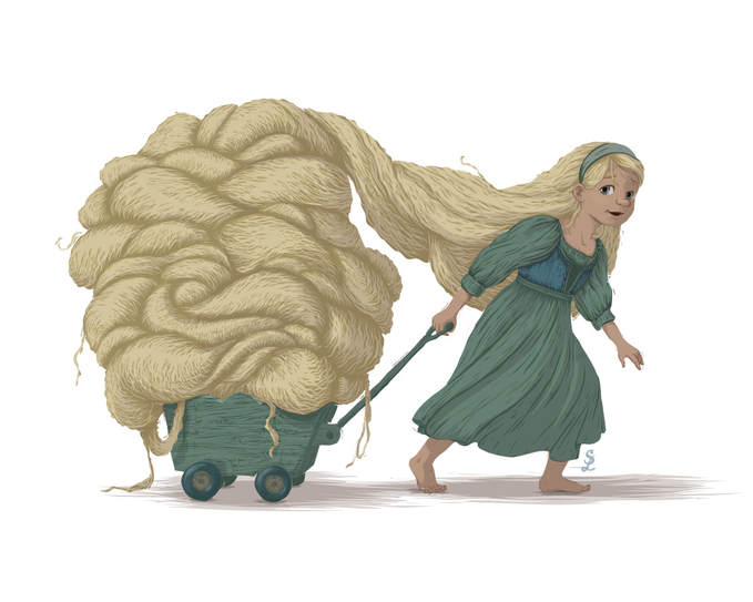
What do you think? Which is your favorite and why?
0 Comments
So one of my goals last year was to put together a portfolio I wouldn't be shy to show to people and actually advertise. I completed that goal, and I've continued to make new portfolio pieces this year as well (though pregnancy has slowed that down somewhat.) I like what I have in my portfolio. But the entire thing is done completely in Illustrator, and while I love the textures and happy accidents I've been able to incorporate into such a digital-looking program, I feel like I'm really leaning on what is familiar. That isn't a bad thing, but I really want to get another set of quality images created--using Photoshop rather than Illustrator. That is the goal for this year. (And maybe next year, seeing as how the other goal for this year is to birth a baby and, you know, keep it alive and not go crazy.) Awhile back the extremely popular digital artist Loish ran a kickstarter campaign which I supported. One of the rewards I received for backing was a video tutorial showing her process of painting a character in Photoshop. I watched it and felt that I really got a lot out of it. I especially liked the way her color scheme is kind of found organically through the process of painting, by using different color tools at various points in the process. So I decided to do a quick character painting in Photoshop to try out some of her methods. Digital painting is still something I'm really insecure in, but I believe that some of Loish's tricks and methods are definitely going to find their way into my digital painting process. I especially love how she uses an unusual color for her drawing lines and uses that to choose colors she adds later. Her colorful outlines make me think of a Wayne Thiebaud painting, whose work I also love. This only represents a few hours of work and I certainly don't feel like it is portfolio quality yet. However I feel like it was a great learning piece and it was a great opportunity to try out Loish's technique. I'm so glad I supported her kickstarter campaign! Since I was in unfamiliar Photoshop territory, I went for a familiar character. I have no idea how many times I've drawn Attolia, but she has kind of become a default for me. I imagine this as being from a specific scene in The Queen of Attolia by Megan Whalen Turner. If you can guess which one you get a gold star ;-) I almost finished writing this whole post, and then the internet ATE it. And I’m not sure I want to write it all out again. Gah. Well, I can simplify. First, the exciting news--I have a new Yiynova MVP22U(V2) Tablet Monitor. For you non digital artist people, that means that I have a special screen and pen that lets me draw directly on the screen, so it is much closer to the experience of actually drawing or painting traditionally than using a mouse or tablet. This purchase was a long time in coming. We’ve been talking about getting a larger monitor for me to use with my laptop for over a year. I’ve been using my cheapo off brand drawing tablet for many years, and it has never been the perfect drawing tool, but as a student it was what I could afford and it was good enough. So, I could get a separate monitor AND a tablet, or for just a little more, I could get the super cool combined version that would also take up less room things AND let me work faster. So, we decided on a tablet monitor. It arrived last Friday night. I couldn’t wait to get it set up and put it through it’s paces. There was a small issue with the drivers at first, but the distributors were extremely prompt about helping me fix it, and then I was good to go. Next big decision: What should I do for my first project on my fancy new toy? I decided to do something I hadn’t ever felt confident in on my old tablet--painting in Photoshop. I’ve always been an Illustrator girl, and a big part of that has been because I never felt like I was able to draw well using a drawing tablet. However, I'd done OK on tablet monitors in my digital painting classes. Time to see if it really made as big a difference as I remembered. I decided to do a Master Copy of a traditional painting in Photoshop, since I’ve been collecting pictures of awesome portrait paintings on Pinterest for AGES. (Pinterest isn’t just for recipes, crafts, and stylish outfit ideas. Artists figured out a long time ago that it is one of the easiest ways to collect and organize awesome pictures you find on the internet. Which I guess is what everyone else does with it anyway, but they don’t really think of it in those terms.) So, a Master Copy. I gave myself some rules before diving in. I wanted my process to imitate oil painting as closely as possible. So, no layers--everything was done on the base canvas layer. Also, I did not do any color picking from my reference picture, I only picked colors I had already laid down on my own copy. My thinking was that my canvas could represent the “palette” of colors that I had already mixed, while the reference photo was just that--my reference. This was also just a good exercise in color matching using the Photoshop color tools, which I am NOT perfect at, so you will notice some color differences between the two. Third, I used brushes with over 70% opacity for the initial 70% of the painting, and then used less opaque brushes or blending tools later. To me, this was like laying down paints on a blank canvas to start, and then painting into wet paints later in the process. I also did not zoom in for the first 70% or so of the painting. This is kind of an indirect correlation, but to me this was like using big brushes to get in the main details in the beginning, and only moving on to smaller brushes to get the little details in the end. Lastly, I tried to match the textures as well as I could, but since I’m relatively inexperienced in Photoshop there was a lot of learning and experimenting with the brushes to try and achieve this, and I still have a lot of work to do there. This is what I felt was least successful in my piece. I started this on Saturday and have spent at least a couple hours on it every day (except Sunday) since then. It isn't perfect but I've spent many hours starting at it, and I think I learned what I wanted to learn from doing the project, so I'm calling it done. It won't be hard to notice differences between the two, just so you know. I'm not THAT amazing at this. Photoshop is still a nuisance to me a lot of the time. But it was good to get out of my comfort zone a little with this piece. So here it is. Which is the original and which is the copy? Here is a closer look at my version. It doesn't look quite as bad when you don't hold it next to the original :-). I guess I caught the Photoshop bug or something. Well, not really. I was wishing almost the whole time I was painting this that I was using oil paint instead. Well, except for when I could just nudge or liquefy things into the right place without having to re-draw them. I like using Photoshop at those moments. But all of the other moments, I was really missing the smell of turpentine. No joke. But, this was really fun to do. It made me think of my head painting class, which I loved. Maybe I'll bust out that old painting box after this--I have a feeling that this is an itch I'll need to scratch. So as I've been trying to put together some new work in "my style"--whatever that might be--I keep hitting walls. What do I want to do? What are the defining characteristics of "my style"? What do I even like? So I decided to do an exercise I've seen a few times on other artist's blogs--an "influence map". This seems to have been a thing a couple years ago, and I saw a bunch of them around and then the trend kind of died. I liked the idea of it even though I never really used it until now. So, here it is: The map is arranged the way it makes sense to me--its my map, I can do what I want ;-). Obviously, I'm in the center. The artists whose pieces actually touch mine are closest to the type of style I'd like to work in. The bigger the piece, the more I'd like to emulate their work in my own.
A little about each artist: 1. John Singer Sargent--The man was crazy awesome at what he did. Painterly portraits, fabric textures described with just a few brush strokes, expressions and colors and shapes that tell you about each person. Man, that guy was crazy skilled. His piece doesn't quite touch the "me" in the middle because, most days, I don't want to paint portraits, I want to paint stories. You can argue about how different those two things if you want, but in any case, If I could create pictures with a fraction of this guy's skill I could die happy. 2. Norman Rockwell--also doesn't touch the little "Me" piece in the center, but I seriously love so much of his work. His story telling ability, his sense of humor, and especially his ability to manipulate the human face into any expression while still maintaining its real-ness... wow. 3. N. C. Wyeth--wow. This guy was awesome. I kind of want to be N.C. Wyeth. I could say that about most of the people on this map, but I'd probably say it about him the most. Could we please go back to the golden age of illustration where novels were illustrated with awesome huge painterly colorful paintings? Because that would be awesome. 4. J. C. Leyendecker. Man, that guy knew how to use a paint brush. He has the most deliberate brush work I've ever seen. 5. Alphonse Mucha--he only gets a little sliver, because I don't really want to be Mucha... but I do really like to draw pretty ladies with swirly hair and drapey clothes. And this guy is seriously the master of pretty ladies with swirly hair and drapey clothes. 6. The Secret of Kells. Yeah, it's a movie, not an artist, but this movie really helped me to understand how much I love simplified shapes and highly stylized characters. I love watching it to this day. It doesn't touch "me" in the center of the map because I don't really want to make movies, but I want to make art with cool textures. 7. Jake Parker. Above my computer I have a little not to myself, which I picked up from this guy--"FINISHED, NOT PERFECT." I need to remember this, to help me to push through to the end of each project. I think this saying is great because it addresses what I see as two of the most common problems creators have--either jumping from idea to idea without finishing any of them, or not moving on from one idea because they have to noodle with it until it's perfect. In addition to the "FINISHED, NOT PERFECT" mantra, watching and listening to his videos about sketchbooks has really helped me to love my sketchbook. I'm not sure I can say I ever really loved sketching before--It was something I did because I was an artist and I was supposed to. Now, its fun. I don't really like drawing robots or monsters or anything that Jake seems to love drawing, but he was a huge influence just for helping me to love my sketching. 8. Tom Whalen is the king of vectors and color schemes, in my opinion. Ironically maybe for someone as in love with painterly art as much as I am, Illustrator always made more sense to me as a way to work digitally. Photoshop just frustrates me. I would be for book covers or childrens books what Tom Whalen is for movie posters. 9.Tom Duxbury is an Illustrator I only came across recently, but I love his simple shapes and color schemes. He is definitely one that I'll keep track of. 10. Margaret Chodos-Irvine makes the coolest prints--to illustrate childrens books! She also writes. Yeah, basically I want to be her. 11. Charley Harper is known for his simplified animal illustrations. Look them up, they're super cool. 12. Shaun Tan wrote AND illustrated my favorite short story collection of all time, Tales from Outer Suburbia. Each story in it has a different illustration style, but each style is well executed and interesting. I love his textures and weird creatures. 13. Jon Foster paints the coolest book covers ever. And he works both digitally and traditionally, sometimes moving back and forth between them for one piece. Cool, eh? 14. Gregory Manchess does awesome painterly illustrative work. Whew. Looking at this list, I'm inspired and intimidated. I've got some work to do. By putting this together, I am able to see some gaps in my work that I need to fill. They are: 1. Backgrounds/environments. I'm bad at them. I need to do more with them. 2. Textures. I love it when people incorporate textures into their work, but I haven't done much of that lately. I need to figure out how to use them more in my work. 3. I seem to have two loves--painterly, on the left side of the map, and shape-y (pretend that's a word) on the right. This might mean that ultimately I'll have two portfolios. I think that first I'll work on shape-y, and then after I've got that together, I'll move to building up a portfolio that is more painterly. This ended up being a really fun exercise. If anyone else puts one of these together, give me a link! I'd love to see it. Just for the record, there are only 2 "super powers" in this series of 10 that I actually have. And this is one of them, kind of. I mean, I'm still working on it. Narrowing down what to do for this one was hard. Should I just say, "I PAINT"? I really wanted to do "I PAINT PORTRAITS" because that is one that I really admire. Eventually I decided to go with "I PAINT WITH OILS," mostly because I think oil painting is awesome. But also I feel like other people have this sort of "super power" attitude about it, like some how its so much harder than acrylics or watercolor or gouache, or digital painting for that matter. I think it just depends who you are. I happen to think oil painting is easier than all of those, but most people seem to disagree with me. I mean, I take it back. Oil painting is super hard and is a super power. Seriously. I see people make amazing painterly pictures and I'm amazed and ecstatic and depressed all at once. I mean, I love that these beautiful pictures exist, but I am so not there yet. Yep. Definitely have some mixed feelings about this super power. Click here to get it on a shirt. Or copy/paste this: http://society6.com/product/i-paint-with-oils-whats-your-super-power_hoody#7=118&19=144&8=36
So I was pretty good about keeping up with that art challenge for a few days, and then totally missed it on the last day. Life happened. Nothing crazy, just... life.
In addition to life happening, I wasn't really sure what to post for this last day. Then I thought, why not post some REALLY OLD stuff? Its nice to see how far I've come. So, here are some paintings I did in high school... plus one from college. I admit, the photographs aren't that great--I'm still a worse photographer than I am painter, and that was truer then than it is now. But still, it's fun to look back sometimes. One of my favorite classes I took as an Illustration major was Head Painting, taught by Chris Thornock. Its funny though, because I never thought I'd really love portrait painting, mostly because I always struggled to get a good likeness when I draw.
Well, painting and drawing are not the same. I feel like paint is more fluid (well, physically, but I also mean in how I use it) and that its easier for me to think in shapes instead of lines. I found that, working in paint, I could get a good likeness as often as not. And that portrait painting was actually, you know... fun. Who knew? I want to get back into the habit of portrait painting, because it's been awhile and I know I'm losing alot of the skills and habits I developed. Thats why I did that painting of Richard a couple weeks ago. I need to get back to that. I just grabbed a bunch of random photos I took of work from that class. In no particular order: I think I'll still come back to refine this picture more, but here is how it looks so far. Day 1: Day 2: Yes, I did wipe it all off and start over. Day 3: Awhile back I made a fold and cut ornament... which I never posted or gave instructions for. Eventually I might.
And then I thought, thats a simple thing to paint. It would be good to start up again with something simple. So, I painted it. It was a good reminder of how much I love painting, and how much I miss it. And how terribly, horribly, completely rusty I am at it. I started it one night in November and never got back to it until last night, when I decided to be done with it. Not because its the best it can be and completely finished, but because it served its purpose--it was a reason to get the paints out, and to remember how fun painting is, and how hard. Here is how it looked, at various points in its life. I noticed too late that when I held the iphone too close to the painting it made the whole picture look cold, with a sort of grey-blue cast over the whole thing. Something to watch for next time. |
Your email will not be shared with anyone. It will only be used for updates from me, and you can unsubscribe at any time.
Want a Print?
Take a look at my print shop on INPRNT.com Categories
All
Archives
September 2020
|