I completed a new piece! This one was inspired by one of my favorite artists, James C. Christensen, who recently passed away. He often created images with elaborate ships, mixed scale, and clever sayings, often in Latin. So it was something of an exercise--not exactly a master copy, and not with the goal of being entirely in his style. I wanted something in my style, but inspired by his. I think I succeeded in that at least. 
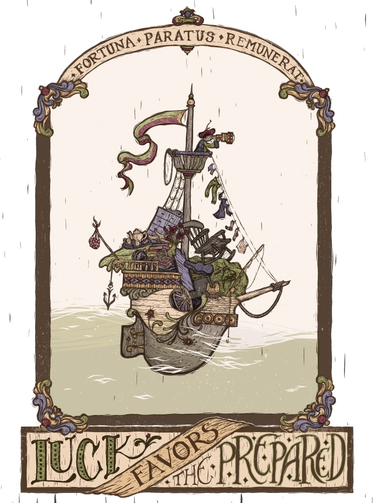
I have progress images (I always think those are fun to see, maybe nobody else does though) but that will have to wait until my internet is working better--its patchy right now for some reason.
2 Comments
So awhile back I did a master copy of a piece by Norman Rockwell. Because, well, Norman Rockwell. Also, master copies are good practice. So after doing that one, of course I had to do one by Rockwell's hero, J. C. Leyendecker. Thats right. Rockwell was a young artist with dreams and heroes once too! And one of his big inspirations was Leyendecker, who was doing Post covers long before Rockwell was. His have a different design sense than Rockwell's certainly, but his humorous scenes I think inspired Rockwell, who took that concept and perfected it. I started this master copy in mid November. Yes, November. Then life happened and it got set aside for awhile, then picked up again, then set aside... so three months later I'm posting it, not because I think its perfect, but because I'm kind of sick of it. I wasn't as strict with myself with this one as I was with the Rockwell copy I did. I did have a few layers (maybe 5 in the end, I think) and I took advantage of some of Photoshop's awesome tools such as Liquefy and Transform to try and get my drawing just right. It still isn't just right, but I don't think I did half bad. One thing I really learned from this is that I need to learn more about how to create and manipulate Photoshop brushes. This was really made clear to me because to me, Leyendecker is ALL ABOUT the brushwork. The man was a master. So I look at his piece with all it's beautiful brush strokes and I try to imitate them in Photoshop and get frustrated because I'm not even close. I know Photoshop can't imitate brush strokes perfectly, but I know it can do a whole lot better than I'm currently getting it to do. Next thing to focus on, I guess. As always, I saved periodically as I worked. Wow, my drawing was WAY off in the beginning! Photoshop makes it much easier to get it right--well, closer to right. Anyway, I think I learned what I needed to learn here and I'm excited to move on from this project. I almost finished writing this whole post, and then the internet ATE it. And I’m not sure I want to write it all out again. Gah. Well, I can simplify. First, the exciting news--I have a new Yiynova MVP22U(V2) Tablet Monitor. For you non digital artist people, that means that I have a special screen and pen that lets me draw directly on the screen, so it is much closer to the experience of actually drawing or painting traditionally than using a mouse or tablet. This purchase was a long time in coming. We’ve been talking about getting a larger monitor for me to use with my laptop for over a year. I’ve been using my cheapo off brand drawing tablet for many years, and it has never been the perfect drawing tool, but as a student it was what I could afford and it was good enough. So, I could get a separate monitor AND a tablet, or for just a little more, I could get the super cool combined version that would also take up less room things AND let me work faster. So, we decided on a tablet monitor. It arrived last Friday night. I couldn’t wait to get it set up and put it through it’s paces. There was a small issue with the drivers at first, but the distributors were extremely prompt about helping me fix it, and then I was good to go. Next big decision: What should I do for my first project on my fancy new toy? I decided to do something I hadn’t ever felt confident in on my old tablet--painting in Photoshop. I’ve always been an Illustrator girl, and a big part of that has been because I never felt like I was able to draw well using a drawing tablet. However, I'd done OK on tablet monitors in my digital painting classes. Time to see if it really made as big a difference as I remembered. I decided to do a Master Copy of a traditional painting in Photoshop, since I’ve been collecting pictures of awesome portrait paintings on Pinterest for AGES. (Pinterest isn’t just for recipes, crafts, and stylish outfit ideas. Artists figured out a long time ago that it is one of the easiest ways to collect and organize awesome pictures you find on the internet. Which I guess is what everyone else does with it anyway, but they don’t really think of it in those terms.) So, a Master Copy. I gave myself some rules before diving in. I wanted my process to imitate oil painting as closely as possible. So, no layers--everything was done on the base canvas layer. Also, I did not do any color picking from my reference picture, I only picked colors I had already laid down on my own copy. My thinking was that my canvas could represent the “palette” of colors that I had already mixed, while the reference photo was just that--my reference. This was also just a good exercise in color matching using the Photoshop color tools, which I am NOT perfect at, so you will notice some color differences between the two. Third, I used brushes with over 70% opacity for the initial 70% of the painting, and then used less opaque brushes or blending tools later. To me, this was like laying down paints on a blank canvas to start, and then painting into wet paints later in the process. I also did not zoom in for the first 70% or so of the painting. This is kind of an indirect correlation, but to me this was like using big brushes to get in the main details in the beginning, and only moving on to smaller brushes to get the little details in the end. Lastly, I tried to match the textures as well as I could, but since I’m relatively inexperienced in Photoshop there was a lot of learning and experimenting with the brushes to try and achieve this, and I still have a lot of work to do there. This is what I felt was least successful in my piece. I started this on Saturday and have spent at least a couple hours on it every day (except Sunday) since then. It isn't perfect but I've spent many hours starting at it, and I think I learned what I wanted to learn from doing the project, so I'm calling it done. It won't be hard to notice differences between the two, just so you know. I'm not THAT amazing at this. Photoshop is still a nuisance to me a lot of the time. But it was good to get out of my comfort zone a little with this piece. So here it is. Which is the original and which is the copy? Here is a closer look at my version. It doesn't look quite as bad when you don't hold it next to the original :-). |
Your email will not be shared with anyone. It will only be used for updates from me, and you can unsubscribe at any time.
Want a Print?
Take a look at my print shop on INPRNT.com Categories
All
Archives
September 2020
|