illustrated by Sarah LuAnn
  • Portfolio
    • Picture Books
    • Covers
    • Middle Grade
    • Comics
    • Maps
    • Stand-alone images and prints
    • Cricut Cartridges
  • Art Classes
    • Drawing Fundamentals
    • Beginning Painting
  • Prints
  • About Me
  • Contact
  • Blog
    • Dummy Worksheets
  • Portfolio
    • Picture Books
    • Covers
    • Middle Grade
    • Comics
    • Maps
    • Stand-alone images and prints
    • Cricut Cartridges
  • Art Classes
    • Drawing Fundamentals
    • Beginning Painting
  • Prints
  • About Me
  • Contact
  • Blog
    • Dummy Worksheets

News, and Recent Experiments

6/11/2019

0 Comments

 
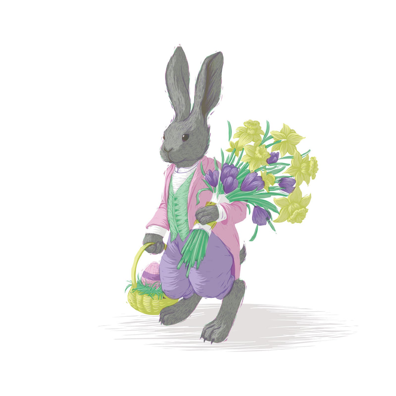
I'm temporarily pulling this blog out of hibernation to show you a few new things I've done recently... and then I'm putting it right back to sleep.

I've been feeling like I'm in a bit of a slump lately, so I've been trying new things to try to work through it. Behold:

In April, I did a quick Easter Bunny sketch. It ended up working for both the SCBWI Draw This! prompt (bloom) and Colour Collective (lemon yellow) as well as the holiday... triple dipping! I challenged myself to only use 4 colors in this--pink, yellow, purple, and green. The grey of the bunny's fur is just the green and pink layered over each other... cool, eh?
Picture
I also played around with some mermaid pictures for Mermay! This first one was another limited palette experiment (limited palettes are FUN!) I think it has only... 6 colors? Anyway, I just wanted to see what would happen if I treated a piece a bit more like a cross between a painting and a reduction print. Some bits I like and some I don't. If I really liked where it was going I would spend some time getting that last 20% just right, but... I don't, so I moved on to other experiments. It was an interesting exercise, anyway.
Picture
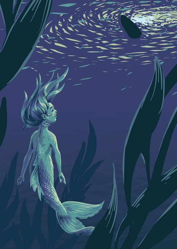
I got an iPad Pro for mothers day (well, mostly just because I said It's Time Now I Need This) and played around in Procreate a bit as well. I kinda just let myself try things and do whatever I felt like, which ended up being in a VERY different style than I usually use. It was fun, but... uncomfortable. I'm headed right back to my comfort zone after this, thank you very much.
Picture
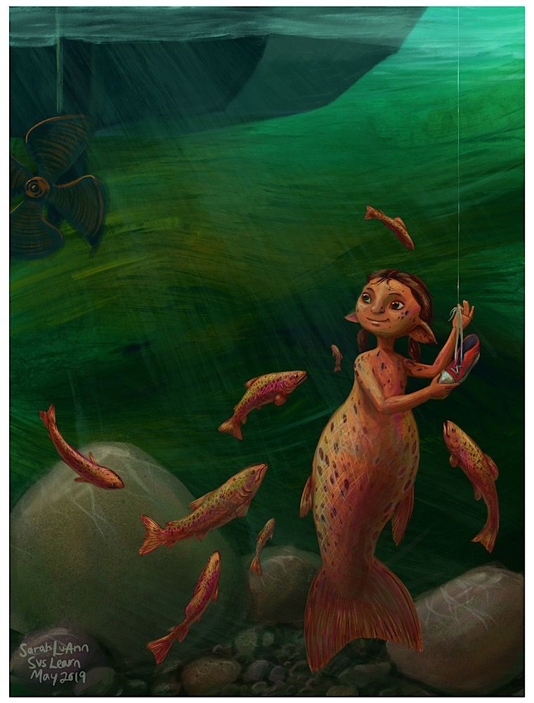
Last but not least... I actually made a VIDEO. 😲 (<- the face you should be making at that news.)
Well, sort of. I just drew in Procreate, and procreate made the video. BUT I recorded audio to go with it, and put it all together, AND uploaded it to Youtube! Which probably seems really basic to a lot of people, but it was a HUGE DEAL to me. Take a look below if you're curious!
That's it for what I've been working on recently.

I also added a links section to the bottom of my "about" page, so you can find pages showing contests, interviews, and challenges I've participated in. Take a look if you're interested.

My final piece of news is that I am now the Illustration Coordinator for my SCBWI Region, Eastern (Upstate) NY. I'm excited and nervous, but I think it will be a great experience so I'm looking forward to it.

And that's it for now--this blog is going back to sleep!
0 Comments

Rapunzel through the years

8/1/2018

0 Comments

 
I've always loved to see how my favorite artists have developed their skill and style over time. The hashtags #drawthisagain or #drawthisagainmeme have lots of fun examples of artists who revisit the same subject matter as they did in the past and show the two versions side by side. I never did it before... but that is about to change!

When the idea of this image first came to me, it stuck in my head and wouldn't leave. This happens every once in awhile. Usually, drawing it out gets it out and thats it. I tried just putting it in my sketchbook, but that wasn't enough. I was in college at the time. and was luckily in a class where we had a lot of freedom in choosing what we would paint for our assignments... which was just the excuse I needed.
Picture
Honestly... I wasn't thrilled with it came out (and, of course, am even less so now). Despite trying multiple thumbnails, getting detailed reference with my roommate posing in costume (Thanks, Annilynski) and doing everything I knew how to do, it just turned out OK. But, I was just a student. Giving it a good try was all I could do, and I did learn a lot from it.

Fast forward a couple years. I had graduated and worked in-house at Cricut for a few months before moving across the country with my husband. I was working from home, experimenting with my process and style and expanding my portfolio. What to draw? This idea jumped to mind--I wasn't satisfied with my last attempt, why not give it another go in an entirely new style?

So I did.
Picture
I liked it much better. I felt that the more graphic style was really working for me, and it had a bit more movement than the previous version.

Fast forward to now, a few years later again. I have been experimenting and developing my style more and found myself wanting to try this image yet again. Now with kids of my own, I found it easier to make Rapunzel look younger as I had always wanted. Its not as graphic as my second, not as modeled/realistic as my first. And I still don't love it, but it is an interesting addition to this series. I think I may have to continue to return to this subject matter over the years to see how my art changes.
Picture
What do you think? Which is your favorite and why?
0 Comments

Leyendecker Master Copy

3/29/2016

2 Comments

 
So awhile back I did a master copy of a piece by Norman Rockwell. Because, well, Norman Rockwell. Also, master copies are good practice. So after doing that one, of course I had to do one by Rockwell's hero, J. C. Leyendecker.
Picture
Thats right. Rockwell was a young artist with dreams and heroes once too! And one of his big inspirations was Leyendecker, who was doing Post covers long before Rockwell was. His have a different design sense than Rockwell's certainly, but his humorous scenes I think inspired Rockwell, who took that concept and perfected it.

I started this master copy in mid November. Yes, November. Then life happened and it got set aside for awhile, then picked up again, then set aside... so three months later I'm posting it, not because I think its perfect, but because I'm kind of sick of it.

I wasn't as strict with myself with this one as I was with the Rockwell copy I did. I did have a few layers (maybe 5 in the end, I think) and I took advantage of some of Photoshop's awesome tools such as Liquefy and Transform to try and get my drawing just right. It still isn't just right, but I don't think I did half bad.
Picture
One thing I really learned from this is that I need to learn more about how to create and manipulate Photoshop brushes. This was really made clear to me because to me, Leyendecker is ALL ABOUT the brushwork. The man was a master. So I look at his piece with all it's beautiful brush strokes and I try to imitate them in Photoshop and get frustrated because I'm not even close. I know Photoshop can't imitate brush strokes perfectly, but I know it can do a whole lot better than I'm currently getting it to do. Next thing to focus on, I guess.

As always, I saved periodically as I worked. Wow, my drawing was WAY off in the beginning! Photoshop makes it much easier to get it right--well, closer to right. Anyway, I think I learned what I needed to learn here and I'm excited to move on from this project.
2 Comments

Trying photoshop with the Loish tutorial

3/22/2016

1 Comment

 
So one of my goals last year was to put together a portfolio I wouldn't be shy to show to people and actually advertise. I completed that goal, and I've continued to make new portfolio pieces this year as well (though pregnancy has slowed that down somewhat.)

I like what I have in my portfolio. But the entire thing is done completely in Illustrator, and while I love the textures and happy accidents I've been able to incorporate into such a digital-looking program, I feel like I'm really leaning on what is familiar. That isn't a bad thing, but I really want to get another set of quality images created--using Photoshop rather than Illustrator. That is the goal for this year. (And maybe next year, seeing as how the other goal for this year is to birth a baby and, you know, keep it alive and not go crazy.)

Awhile back the extremely popular digital artist Loish ran a kickstarter campaign which I supported. One of the rewards I received for backing was a video tutorial showing her process of painting a character in Photoshop. I watched it and felt that I really got a lot out of it. I especially liked the way her color scheme is kind of found organically through the process of painting, by using different color tools at various points in the process.

So I decided to do a quick character painting in Photoshop to try out some of her methods. Digital painting is still something I'm really insecure in, but I believe that some of Loish's tricks and methods are definitely going to find their way into my digital painting process. I especially love how she uses an unusual color for her drawing lines and uses that to choose colors she adds later. Her colorful outlines make me think of a Wayne Thiebaud painting, whose work I also love.

This only represents a few hours of work and I certainly don't feel like it is portfolio quality yet. However I feel like it was a great learning piece and it was a great opportunity to try out Loish's technique. I'm so glad I supported her kickstarter campaign!

Since I was in unfamiliar Photoshop territory, I went for a familiar character. I have no idea how many times I've drawn Attolia, but she has kind of become a default for me. I imagine this as being from a specific scene in The Queen of Attolia by Megan Whalen Turner. If you can guess which one you get a gold star ;-)
Picture
1 Comment

Basic Forms

10/28/2015

0 Comments

 
So, this post is late. Not just a day late-two whole days late. How could I do such a thing? Well, on Monday I was very, very sick. I don’t think I even touched my computer that day--that sick. I didn’t do much of anything that day, actually. Then Tuesday was a recovery and catch-up day. So that brings us to Wednesday.

But I AM here, and I’m getting this post up. Better late than never, right?

And this is going to have to be another 2-week-er. Because that is how my life is going around now.


Envelope drawings were fun this last week. I did mine in ball point pen, which is really a comfort sketching medium for me--yes, I’m more comfortable sketching in pen than in pencil. My highschool teacher had us always sketch in pen and I got used to it. The nice thing about ball point pen is that you can push soft for a light line, and push hard for a dark line. In some of these my “envelope” lines are more visible than others, but you’ll just have to trust me on this one--I drew an envelope for these.
Picture
Picture
Picture
This week I want to start transitioning into skills that will help you (and me!) draw from imagination. Most of the exercises we’ve done so far really depend on having your subject right in front of you. But I’m an illustrator, and I can’t always find a real live three dimensional example of what I am drawing. I have to use my knowledge built up from drawing from life (As we’ve been doing for the last few weeks, right?) to imagine how something might look.

So this week I’ve decided to try an exercise I’ve actually never done before, but seen recommended elsewhere. I’m hoping that it will be as helpful as I’ve heard it is. If not, well, I’ll keep looking for something to teach these principles.

Everything we see can be simplified into combinations of certain basic 3-dimensional forms. Legs can be simplified to cylinders, an apple is basically a sphere, a book is a box shape, etc. Understanding these basic types of forms and how they occupy space can help us to simplify the things we imagine into manageable forms we can understand and draw. So this week, we’re going to get to know those forms.

Find or make each of these, all in one color: a cone, a cylinder, a sphere, a box or cube, and a pyramid. I will make some paper patterns (except I can’t really do a sphere), but you may have things around the house that will work--just wrap a can of soup in paper and you have a white cylinder. A white ping pong ball needs no alteration, there is your sphere. They don’t even need to be white, but I would prefer that they are all one solid color, so that the form differences are the important thing, rather than color or value or pattern.

Each day, draw three or more of your forms at different angles and arrangements. Pay attention to what happens to each face when they are above your eye level versus below, How they look when stacked on top of each other, in different lighting situations, etc. Be creative. Since we are mostly worried about the forms, don’t get too caught up in the shading--you can make an indication of where the shadows are, but don’t spend forever on this. Like previous weeks, we’re looking at spending about 20 minutes on these, but not more.

If it takes you less than 20 minutes to make your sketch and you’ve double checked it, go ahead and sketch something else--but as you do, look for these basic forms in the things you sketch.

cone.jpg
File Size: 32 kb
File Type: jpg
Download File

cylinder.jpg
File Size: 25 kb
File Type: jpg
Download File

cube.jpg
File Size: 25 kb
File Type: jpg
Download File

pyramid.jpg
File Size: 40 kb
File Type: jpg
Download File

Exercise: Form Drawings

Goal/Focus:
Understanding basic forms and how they occupy space

Materials: Sketchbook, pen or pencil

Assignment: Each day, do a drawing of three or more of the basic forms in different arrangments. Arrange them in front of each other, stacked, lined up, or whatever way you can think of. Try different viewing levels--look down on them from above, or place them at eye level, or above your eye level. Spend about 20 minutes on each drawing.

If you have extra time or want to do more sketching, look for these forms in everyday object. Draw the object as these basic forms before breaking it down further into specific details--draw a book first as a box/ rectangular prism, draw a vase first as a cylinder, etc.

Have fun!
0 Comments

General to Specific

10/13/2015

0 Comments

 
No, I didnt get this post up yesterday. Yes, I should have. But I was at the Norman Rockwell Museum. Looking at paintings by, you know…. Norman Rockwell. And life has been kind of crazy these last couple weeks anyway. So I’m only kind of sorry for being late.

I, for one, really loved doing gesture drawings these last couple weeks. I will admit, because of the life being crazy stuff, I didn’t get to do as many as I wanted. But for me I felt that I had a real breakthrough with Gesture drawings this week. I found myself actually enjoying them, and I’ve never enjoyed gesture drawing before.

Picture
Picture
Picture
I think for me the real difference was not making myself use just a few lines to describe the movement. I kept my pen moving and massed in the entire form, rather than just focusing on edges or a single line of movement, and that is what worked for me. I never had a teacher do them that way, so the way Nicolaides explained them was very new and helpful. Everyone needs to find their own way that works I guess. Thats one reason why having multiple teachers or sources of information can be helpful.

Todays concept was explained to me in a couple different ways by different teachers I had over the years. My college teacher would always tell us in figure drawing class, “Make an envelope and put the figure in.” It took me awhile to understand what he meant by that. An envelope? Maybe I’m too literal, but I would imagine slipping a drawing into an envelope and didn’t see how that related to how I was drawing at all.

Now I understand that what he was talking about was something very practical for artists. It is a concept that my high school art teacher put into somewhat simpler terms. She would say, over and over. “Work from general to specific. General to specific. General to specific.”

What does that mean?

It means that beginning artists, and sometimes experienced ones, have a tendency to get caught up in details. When we are drawing the face, we sometimes want to dive right in and put all the eyelashes on the eye. But before that, you need to make sure you have the eye in the right place. And that the nose is in the right place. And the hair, the head, the neck.

You need to start with the overall shape, and break it down into smaller and smaller details. This is an idea that is demonstrated in the books “Drawing Made Easy” and “Practial Drawing” by E. G. Lutz. (It is also probably outlined elsewhere, but public domain books make things easy on us.)
The most important part about todays exercise is how you start it. Start by looking at the entire shape of the thing you want to draw. Decide where you want that shape to be on your paper. This the beginning (just scratching the surface) of composition, because you do NOT have to just put it in the middle of your page. Maybe it would look better towards one side or the other, or cropped in a certain way. Make that decision.

Then, very loosely give yourself a general outline to work within. Look at the pictures above from the Drawing Made Easy book--Flowers start as an ellipsis, an owl begins as a rectangle, a duck begins as two triangles. You don't have to start with a geometric shape if that doesn't make sense to you, as long as you are looking at the whole shape without worrying about any of the little details. We are NOT doing a Negative Space drawing here, but it can be helpful to look at the negative spaces just to see if you have the overall shape correct--we don’t care about all the little ins and outs of the shape yet. In the duck picture above, you notice that the triangles go around the very outer points of the shape, and then when it is refined the inner points are defined.


Once you have that, Think of the next logical way to break down your shape. For example, lets imagine you were drawing a portrait. Look at other large shapes--what is the overall shape of the hair? We don’t care about the individual hairs yet, we are looking at the entire mass. What is the overall shape of the shirt? What shape do you see formed by the neck, between the shirt and the jaw? These aren’t negative shapes, but they require a similar kind of thinking--do NOT think “hair” or “neck” or “shirt”--think “shape”.  After having a general outline of the larger shapes, find the center line of the face, and then lightly mark where the brows, eyes, nose and mouth fall. Keep moving around the picture, bringing the whole thing along step by step--don’t stop at one spot and finish it until you bring the rest of the drawing to a similar level. No eyelashes until the end.

Exercise: Envelope Drawings

Goal/Focus: Seeing large shapes, correctly placing large forms before adding details, accuracy, composition

Materials: Sketchbook and pen or pencil

Assignment:
Choose a new subject to draw each day this week. Draw from life, not photographs. Think of the overall shape of your object and where you want to place it on your page before starting. When you begin the drawing, loosely outline where you want the object to be, and then gradually break it down into smaller and smaller shapes. Spend at least 20 minutes on your drawing--move slowly, this isn't about drawing quickly, but rather about drawing accurately. 

0 Comments

Drawing the Fourth Dimension

9/28/2015

0 Comments

 
OK, so I have to say--that last exercise has been my favorite so far. I just think scribbling is so FUN. And I have always thought better in shapes rather than in lines. And, while I was having all that fun scribbling, I was also seriously thinking about what I was drawing, and understanding it a little bit better. So basically, modelled drawings are the best.

Picture
Picture
Picture

Also, a heads up--this October I am planning to do the full Inktober challenge. I may decide that it is going well and that I will have time to post, but as of now the plan is to only do TWO of these drawing exercises in October, or every other week. I feel that that way I can still keep my momentum with these exercises without overloading myself. So, this week's exercise will cover two weeks.

Each week when it comes time to write up a new exercise, I go to my master plan and re-order the exercises I have outlined. I don’t think that's a bad thing. As I have actually sat down to do each exercise, I understand its benefits better, and also how it relates to the others.

So far, we have done Pre-Instruction Drawings, Negative Space Drawings, Blind Contour Drawings, and Modeled Drawings. I feel that the natural next step from there (though I didn’t see it before) is Gesture Drawings.

I’m really bad at gesture drawing.

At least, I have always felt that way. (So of COURSE it would fall on the two-week-long space…)

However, I think that may partially be due to the fact that in school I was gesture drawing next to people who learned from the amazing Ryan Woodward (though I never got to be in one of his classes--I was in illustration, not animation, which are DIFFERENT). He draws amazing gestures really quickly that also actually look like people. *sigh* But (again) coming back to Nicolaides’ book The Natural Way to Draw (this is our last exercise from that book, by the way) I saw that I could loosen up and just draw a gesture and not worry about whether it looked good or not. Because the important thing about gesture drawing is capturing the movement, not the form. And (unless your name is Ryan Woodward) they are for study, not for show.

And I will say this--as jealous as I am of Ryan Woodwards amazing skill in drawing accurate gesture drawings, he doesn’t sacrifice an understanding of movement for accuracy. Behold:
I love the way that Nicolaides described the process of gesture drawing:
Picture
Picture
Picture
I can’t get a quick, even somewhat accurate drawing in less than a minute--but I can draw a loose set of lines and scribbles that represent the movement of the figure. So can you ;-)


The tricky thing about gesture drawing is that we’re adding another dimension--which we have been doing with each exercise. Negative space drawings are pretty two dimensional, even when drawing from life. With blind contour drawings we start to think about three dimensions, but with Modeled drawings we really push that idea further and are really focusing on how a form occupies space. Gesture drawings focus on movement. Movement has to happen over time. So, in our flat unmoving drawing, we are trying to get across the idea of this four-dimensional event.


The other tricky thing about gesture drawing is that we all (including me) get caught up in the idea that drawings ought to look like someTHING. We can argue about whether a gesture is a “thing”, (it is certainly a noun, but isn’t a person or place--so is it a thing, or an idea?) but while it is done by something solid, the gesture itself is not. But even though it isn’t solid, and arguably isn’t a “thing”, you can still draw it. (One of these days I’m going to do my whole spiel on how abstract and representational art are more closely related than most people think. But not today.)


Exercise: Gesture Drawings

Goal/Focus: seeing movement, making quick decisions, sketching on-the-go

Materials: Sketchbook and pen or pencil

Assignment: Every day, spend at least 20 minutes doing gesture drawings. These should be quick, no longer than 2 minutes apiece. Draw impressions of the movement of people or animals or things. Focus on ACTION, not edges or details. Think through the action as you draw it--what came before, what will come next? It may help to think of an attitude or feeling--tired, happy, angry, scared, etc. Choose curved or straight lines depending on the action.

AT LEAST once (but hopefully more), go to a park, playground, sports game, dance class, pool, zoo, or mall, (anywhere people or animals are moving in fast, dynamic poses) to draw from life. Other days you can use photos, figure drawing websites (just search gesture drawing or figure drawing. Here is one I have used, but there are others.)

Have fun!


Picture
0 Comments

New Hardware and a Master Copy

9/24/2015

1 Comment


I almost finished writing this whole post, and then the internet ATE it. And I’m not sure I want to write it all out again. Gah. Well, I can simplify.

First, the exciting news--I have a new Yiynova MVP22U(V2) Tablet Monitor. For you non digital artist people, that means that I have a special screen and pen that lets me draw directly on the screen, so it is much closer to the experience of actually drawing or painting traditionally than using a mouse or tablet.

This purchase was a long time in coming. We’ve been talking about getting a larger monitor for me to use with my laptop for over a year. I’ve been using my cheapo off brand drawing tablet for many years, and it has never been the perfect drawing tool, but as a student it was what I could afford and it was good enough. So, I could get a separate monitor AND a tablet, or for just a little more, I could get the super cool combined version that would also take up less room things AND let me work faster.


So, we decided on a tablet monitor.

It arrived last Friday night. I couldn’t wait to get it set up and put it through it’s paces. There was a small issue with the drivers at first, but the distributors were extremely prompt about helping me fix it, and then I was good to go.

Next big decision: What should I do for my first project on my fancy new toy?

I decided to do something I hadn’t ever felt confident in on my old tablet--painting in Photoshop. I’ve always been an Illustrator girl, and a big part of that has been because I never felt like I was able to draw well using a drawing tablet. However, I'd done OK on tablet monitors in my digital painting classes. Time to see if it really made as big a difference as I remembered.

I decided to do a Master Copy of a traditional painting in Photoshop, since I’ve been collecting pictures of awesome portrait paintings on Pinterest for AGES. (Pinterest isn’t just for recipes, crafts, and stylish outfit ideas. Artists figured out a long time ago that it is one of the easiest ways to collect and organize awesome pictures you find on the internet. Which I guess is what everyone else does with it anyway, but they don’t really think of it in those terms.)

So, a Master Copy. I gave myself some rules before diving in. 

I wanted my process to imitate oil painting as closely as possible. So, no layers--everything was done on the base canvas layer.

Also, I did not do any color picking from my reference picture, I only picked colors I had already laid down on my own copy. My thinking was that my canvas could represent the “palette” of colors that I had already mixed, while the reference photo was just that--my reference. This was also just a good exercise in color matching using the Photoshop color tools, which I am NOT perfect at, so you will notice some color differences between the two.

Third, I used brushes with over 70% opacity for the initial 70% of the painting, and then used less opaque brushes or blending tools later. To me, this was like laying down paints on a blank canvas to start, and then painting into wet paints later in the process.

I also did not zoom in for the first 70% or so of the painting. This is kind of an indirect correlation, but to me this was like using big brushes to get in the main details in the beginning, and only moving on to smaller brushes to get the little details in the end.

Lastly, I tried to match the textures as well as I could, but since I’m relatively inexperienced in Photoshop there was a lot of learning and experimenting with the brushes to try and achieve this, and I still have a lot of work to do there. This is what I felt was least successful in my piece.

I started this on Saturday and have spent at least a couple hours on it every day (except Sunday) since then. It isn't perfect but I've spent many hours starting at it, and I think I learned what I wanted to learn from doing the project, so I'm calling it done.

It won't be hard to notice differences between the two, just so you know. I'm not THAT amazing at this. Photoshop is still a nuisance to me a lot of the time. But it was good to get out of my comfort zone a little with this piece.


So here it is. Which is the original and which is the copy?

Picture
Here is a closer look at my version. It doesn't look quite as bad when you don't hold it next to the original :-).
Picture
1 Comment

Inside Out Thinking

9/21/2015

0 Comments

 
So, who did some blind contour drawings last week? Me! I did! If was fun and hard and weird. Looking at what you are drawing is such a natural thing to do, it is hard to force yourself to look away. However, I really did feel that it helped me to focus on just looking, and not even worrying about whether my drawing looked nice, which is a good thing. I did struggle to spend long enough on my drawings, so I've edited the assignment from what it was originally so they only need to take 10-15 minutes rather than 20. I did almost make it to 20 with the most complex object I chose to draw, but the others just didn't take as long. Maybe I just have a hard time moving slowly.

There is kind of a charm to blind contour drawings, despite their weirdness. Maybe its just me, but I think they look kind of interesting.
Picture
Picture
Picture
Picture
Picture
Picture
I believe that, in order to learn to draw well, you need to learn to look at things and think about what you see differently from those who haven't yet learned to draw. (I won't say people can't draw. They can if they choose to learn.) In the first exercise, we thought of the spaces where an object is NOT as the actual subject of our drawings. With blind contour drawings, we learned to really stop and look at an object and take the time to see how the edges really interact with each other, how one leads to another. Both of these exercises focused on edges--where one object ends and another begins.

Well, this week we are going to do something different. If drawing is about learning to see things differently, there must be many different ways to look at things. So this week, rather than focusing on edges, we will focus on the actual physical form.

This weeks exercise is adapted from the exercise on Modeled Drawings from Nicolaides' book The Natural Way to Draw (remember him from last week?) This is how it works: If, for example I were drawing a person, I would look at the whole form and try to decide where the very center of the entire three dimensional form is--not just the center point between two edges, but the core of the entire form. I would place my crayon (not a pencil or pen this time) on my paper where I would want this center point to be on my page. Then, without pressing hard and using a roundish wandering scribbling line, I would build up the entire form from that center point, imagining I was building it up out of clay as I add layers of scribbles. I would Imagine I was building a model of clay--thus the name, modeled drawing. 

Once I had the entire form built, I would pay special attention to how the form turns--which parts are closest to me and which are further away. I would go over the form again, pressing very lightly where the form is closest to me, and pressing harder and harder as the form turns away from me. Again, I would be focusing on the actual form of my subject and how it turns, how it would feel if I were making it with clay. The result would be a drawing that seems to have some dimensionality, not because we have drawn the lights and shadows, but because we have consciously represented the form and how it occupies space.

So, what is the point?

Out of all the figure drawing classes I took as an art student, only one of my teachers had us do an exercise like this. At the time I didn't entirely understand it--maybe because it wasn't well explained, or maybe because I, like many people who learn to draw with narrow pencil and pen lines, was hooked on edges. It was in my head painting class that I really began to understand the importance of starting out by building your entire shape before defining the specifics of the form. It is my personal opinion that we use pencils and pens to learn to draw, not because they are actually the easiest tools to help us learn all the concepts, but because they are simple and familiar and don't make a mess, like paints and charcoal and chalk pastels, etc. do. Their drawback is that, with their small points that draw little details so well, when we use them we are too easily pulled into the details and specific little nit-picky things rather than getting the overall form down first. As my high school art teacher said about 50 times a day: work from General to Specific. General to Specific. General to Specific.

Its a common joke among artists that you can spend all your time drawing one eye (or hand, or other part of a thing) and then when it comes time to draw the other eye (or the rest of the body, or whatever) you find you can't get it to look right, or that you put it in the wrong place. One way to combat this "one-eye syndrome" is to force yourself to stay away from details until the entire form is working. After you know you have everything in the right place, you can draw the eyelashes.

And thats just one thing this week's exercise can help us with. I haven't even gotten to how it is important to think about how an object turns and occupies space, but I think I'll talk about that with one of the following exercises.

Time for homework.

Exercise: Modeled Drawings

Goal/Focus: Seeing the entire form before getting into details, understanding how a form turns and occupies space

Materials: Sketchbook, crayons (charcoal, conte crayon, or chalk pastels are also good for this exercise, but not everyone has those lying around.)

Assignment: Spend 20-30 minutes a day doing modeled drawings, 2 each day (10-15 min each). Do these drawings from life, not photographs. (This should be a given by now, but I'll probably keep saying it.) Starting in the middle of the form, scribble your way out to fill in the entire shape. Then (using a second, darker crayon if you want--though you can do the entire drawing with one crayon if that works) model your form by pushing harder in the places where the form turns away from you and drawing very lightly where it is close.

Because of the way this exercise works, it can be easier to do this with softer, more organic shapes. However, if you want to do it with more geometric shapes go ahead, but remember--we are NOT focusing on edges this week. You'll naturally end up with edges by filling in the form, but they aren't what you are focusing on.

Some ides for subjects:
People and animals are ideal for this. See if you can catch a friend or pet while they're sleeping.
Soft couches or chairs, or other furniture (a toilet would actually work really well, if you don't feel too weird about drawing it)
Wrinkled fabric--a towel or coat hung on a peg, a blanket dropped on the floor
Trees (though we're getting into the season where they lose a lot of their form--get to them while they still have leaves!)
Clouds (work fast!)

As with previous exercises, these are just ideas and you should not feel limited to these subjects. If you see something that looks really interesting to draw, go for it. Have fun!


0 Comments

Having the Patience to Pay Attention

9/14/2015

0 Comments

 
I know I said that I would post my pictures of the exercises on Friday, but... I didn't. I'm posting them on Monday. Which I think might actually work better for me, so I'll probably stick with this. We can go over the principles of last week before diving into some new ones. (Maybe I should say "I", since I'm likely the only one reading and doing these exercises, but I enjoy pretending that you are there, because you are pretty great. :-)

So, last week we did Negative Space drawings! I have an admission to make: I only got 4 of the 5 drawings done. So I get like a B- or something like that. But we're not grading this, so I guess I just get 4 drawings worth of learning instead of 5.

Unlike last week's, I have decided to show my drawings here, but let me preface it first with this: while negative spaces were the focus, I found myself using many other drawing techniques I've learned to get these drawings to be (more or less) accurate. If your negative space drawings are less accurate than these, that is more than OK. Here and elsewhere on the internet there are other exercises and drawing techniques that can help you.

If, however, your drawings are already more accurate than mine, well, good job! Why are you here again? Oh yes--nobody is too good for the basics.
Picture

Picture
Picture

Picture

So, how did you do? If you actually did it, then that is wonderful in and of itself. If you feel like you can now draw better than before as a result of the exercise, that is even better. It was helpful for me too, and it wasn't new to me at all.

You may notice when looking at my drawings, and maybe your own, that these are not nice, pretty drawings which you would want to hang on your wall. They look like what they are--learning exercises. Most of the drawings you will produce from the exercises I outline will probably look the same. Today's exercise, which is inspired by one outlined by Kimon Nicolaides in his book The Natural Way to Draw, will probably be the same. That is OK. On this topic Nicolaides said,
Picture
Picture
So I'm showing you the drawings I did as an exercise, but I do not expect you to do so as well if you feel self conscious about it. If people ask to look through your sketchbook and you feel uncomfortable about it, it is OK not to let them. If, however, you are OK with showing people your work, go ahead. Do what you are comfortable with--as far as showing your sketchbook goes, that is. I do hope, however, that some of these exercises are a little uncomfortable to do, because they are meant to help you to look and think in a new way--that is what drawing really is. And it isn't always comfortable.

That is why I don't like one of the more popular types of drawing books. I'm talking about they type where it shows you how to draw an animal by starting with a structure of basic shapes and then breaking them down and adding details. The principle isn't exactly a bad one, as far as it goes, because that is one good method of drawing something. The problem is, it doesn't teach you how to do it--it does it for you. Some people are able to figure out the principle from using the book, but most (in my experience) are not--which is why this picture I've seen floating around various social media sites is funny. To most people, this is what the books actually look like--they outline what seems to be a simple framework, then throw on all the details without actually teaching anyone how they arrived at the final result.

Unsurprisingly, people get frustrated with this type of instruction and conclude that they can't draw. I believe the problem here is two fold. One, the book does most of the work for the student, without explaining the principles used. Because of this they become dependent on the book, and can't produce any drawing that isn't broken down for them. Two, the whole idea of the book is based on the premise you don't need to work hard and produce some ugly exercise drawings before you produce a masterpiece--if you just follow the step by step instructions, you will have a beautiful drawing to hang on your wall!

Sorry, friends. It just doesn't work that way. As our friend up-post, Kimon Nicolades said,

Picture

Hmm, you're saying. You seem to be foreshadowing something here. I seem to be getting the impression that the next exercise will produce ugly drawings that I will want to hide from every living soul.

Well, that may be true. But the principle is that you will come out of this with that much more of an understanding of how things actually look. You ultimately will be able to break down what you see into manageable parts, without even needing a book to do it for you. That is what we are aiming for.

So what is this weeks exercise, you ask?

This week, we are doing Blind Contour Drawings. These are pretty fun. Be excited.

I first read about blind contour drawings in Drawing on the Right Side of the Brain, but Betty Edwards got the idea from--you guessed it--our friend Kimon Nicolaides, in his book The Natural Way to Draw. Though they both use this exercise, they have different ways of explaining how to do the exercise and different explanations about why it is helpful. I will attempt to summarize their ideas, as well as offering a few of my own.

First, a summary of the exercise. What exactly is a Blind Contour Drawing? We all know what "blind" means--not being able to see. But what is a contour? A contour is an edge or an outline. We worked with edges last week in our negative space drawings. Here, we will focus on more than just where one object ends and the next begins. For our contour drawings we will also include corners and wrinkles. Not shadows or colors--just contours. Outlines. Edges.

With those definitions, have you figured out what a Blind Contour Drawing is? It is a drawing where you draw the outline of your subject without looking at your paper. You focus completely on following the outlines and edges of the subject with your eyes while simultaneously drawing them--without looking away, even to check your drawing. You keep your pencil on the page, because if you lift it off you can't look back at the drawing in order to put it back in the right place.

(In some versions of the exercise you are allowed to lift the pencil and look back at your drawing periodically. But we're not doing it that way. We're going all the way!)

So, what is the point?

For Nicolaides, a big part of this exercise is the conviction that your pencil is actually touching the thing that you are drawing--that you are pulling your pencil along the outlines of your actual subject. This essential to his definition of a contour--it is something you can actually feel, even if you are blind, as opposed to things you can only see, like a shadow or a color. If you are able to convince yourself that you actually feel what you are drawing, you will have a much more complete experience of that thing and what it actually looks like.

For Betty Edwards, the important thing about this exercise (as with most of the exercises in her book) is the switch from Left brain to Right brain thinking. For Edwards, the left brain is satisfied to label something as, for example, a hand, and move on. When you stare at the hand and draw all the little details of it--the edges, the wrinkles, the outlines--the Left brain bows out and lets the Right brain do it's thing.

(Since the publishing of Drawing on the Right Side of the Brain Psychologists have done more studies and now believe that the separation between Right and Left brain isn't as distinct as it was once supposed. However, I believe that for learning to draw it can be useful to think of that separation between types of thought, so I don't take issue with it as far as it goes. We're here to draw, not psycho-analyze ourselves.)

So that is what Nicolaides and Edwards think of this exercise. But since this is my blog, I get to have an opinion too, limited though my experience may be compared to theirs. In addition to their ideas, I believe this exercise is about focus and patience. A blind contour drawing, according to both of them, must not be done quickly, but rather meticulously. Do we have the patience to look, really look, at one thing for 20 or 30 minutes? Do we have the patience to look at one stationary thing for even longer than that? I think I have less patience of this sort of thing than I did a couple of years ago. Having the patience to really look at something is essential to drawing well.

To me, this exercise is about focusing. Its about the experience of really, deeply seeing what you are looking at. The drawing you produce is simply evidence of that experience, it is not the actual purpose of the exercise.


Are you ready for the homework?

Exercise: Blind Contour Drawings

Goal/Focus: Learning to Focus, developing patience, understanding of how things really look

Materials: Sketchbook, pen or pencil

Assignment: For at least 20-30 minutes a day (M-F), do two blind contour drawings (10-15 minutes each). Do these drawings from life, not photographs. Choose a subject that is complex enough to spend 15 minutes staring at. Do not lift your pencil from the paper, and do not look at your paper until at least 10 minutes have passed and your drawing is finished. If it takes more than 15 minutes, that is a GOOD thing. That means you are really slowing down--speed is the opposite of what we are going for here.

You can use similar subjects to those you used for negative space drawings, if you want, or you can find new subjects to draw. A few ideas:

Your hand or your foot
a wrinkled piece of paper or fabric
A person or face
Flowers, plants, or trees
Grouped things you have around the house--a cup holding pencils, a pile of magazines, a bowl of fruit, the contents of a drawer.

Don't limit yourself to these ideas--draw what you want. If you find yourself drawing too quickly, try putting the pencil in the hand you don't normally use to draw--that will slow you down. Your lines might be more wobbly, but this isn't about making a nice drawing anyway.

Remember: you aren't trying to draw quickly. you are learning to observe deeply.

Have fun!

0 Comments
<<Previous

    Let me email you a Creativity Workbook full of fun drawing exercises:

    * indicates required
    Your email will not be shared with anyone. It will only be used for updates from me, and you can unsubscribe at any time.

    Want a Print?

    Take a look at my print shop on INPRNT.com

    Categories

    All
    Ambigrams
    Art
    Books
    Comic
    Craft
    Creativity
    Deep Thoughts
    Drawing Exercises
    Dummy Book
    Folding
    Goals
    Holiday
    Illustration
    Inktober
    Master Copy
    Painting
    Paper
    Personal
    Polyhedron
    Portrait
    Printable
    Progress Photos
    Snowflake
    Sourdough
    The Artist And The Engineer
    Whats Your Superpower?

    Archives

    September 2020
    March 2020
    January 2020
    December 2019
    July 2019
    June 2019
    March 2019
    February 2019
    January 2019
    October 2018
    September 2018
    August 2018
    June 2018
    May 2018
    April 2018
    March 2018
    December 2017
    November 2017
    September 2017
    August 2017
    June 2017
    April 2017
    February 2017
    January 2017
    December 2016
    November 2016
    October 2016
    May 2016
    April 2016
    March 2016
    February 2016
    December 2015
    November 2015
    October 2015
    September 2015
    August 2015
    July 2015
    June 2015
    May 2015
    April 2015
    March 2015
    February 2015
    January 2015
    December 2014
    November 2014

    RSS Feed

All content on this site was created by Sarah LuAnn Perkins. Do not use without permission.
Copyright © 2020
  • Portfolio
    • Picture Books
    • Covers
    • Middle Grade
    • Comics
    • Maps
    • Stand-alone images and prints
    • Cricut Cartridges
  • Art Classes
    • Drawing Fundamentals
    • Beginning Painting
  • Prints
  • About Me
  • Contact
  • Blog
    • Dummy Worksheets