illustrated by Sarah LuAnn
  • Portfolio
    • Picture Books
    • Book Covers
    • Middle Grade
      • Return of the Thief
      • A Kernel of Magic
      • Backpack Dragon
      • A Groundbreaking Journey
    • Comics
    • Maps
    • Stand-alone images and prints
    • Cricut Cartridges
  • Art Classes
    • Drawing Fundamentals
    • Beginning Painting
  • Prints
  • About Me
  • Contact
  • Blog
    • Dummy Worksheets

Drawing the Fourth Dimension

9/28/2015

0 Comments

 
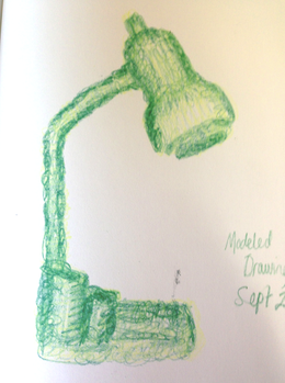
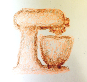
OK, so I have to say--that last exercise has been my favorite so far. I just think scribbling is so FUN. And I have always thought better in shapes rather than in lines. And, while I was having all that fun scribbling, I was also seriously thinking about what I was drawing, and understanding it a little bit better. So basically, modelled drawings are the best.

Picture
Picture
Picture

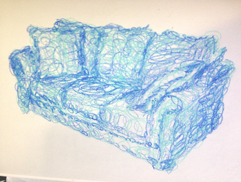
Also, a heads up--this October I am planning to do the full Inktober challenge. I may decide that it is going well and that I will have time to post, but as of now the plan is to only do TWO of these drawing exercises in October, or every other week. I feel that that way I can still keep my momentum with these exercises without overloading myself. So, this week's exercise will cover two weeks.

Each week when it comes time to write up a new exercise, I go to my master plan and re-order the exercises I have outlined. I don’t think that's a bad thing. As I have actually sat down to do each exercise, I understand its benefits better, and also how it relates to the others.

So far, we have done Pre-Instruction Drawings, Negative Space Drawings, Blind Contour Drawings, and Modeled Drawings. I feel that the natural next step from there (though I didn’t see it before) is Gesture Drawings.

I’m really bad at gesture drawing.

At least, I have always felt that way. (So of COURSE it would fall on the two-week-long space…)

However, I think that may partially be due to the fact that in school I was gesture drawing next to people who learned from the amazing Ryan Woodward (though I never got to be in one of his classes--I was in illustration, not animation, which are DIFFERENT). He draws amazing gestures really quickly that also actually look like people. *sigh* But (again) coming back to Nicolaides’ book The Natural Way to Draw (this is our last exercise from that book, by the way) I saw that I could loosen up and just draw a gesture and not worry about whether it looked good or not. Because the important thing about gesture drawing is capturing the movement, not the form. And (unless your name is Ryan Woodward) they are for study, not for show.

And I will say this--as jealous as I am of Ryan Woodwards amazing skill in drawing accurate gesture drawings, he doesn’t sacrifice an understanding of movement for accuracy. Behold:
I love the way that Nicolaides described the process of gesture drawing:
Picture
Picture
Picture
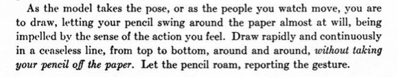
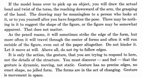
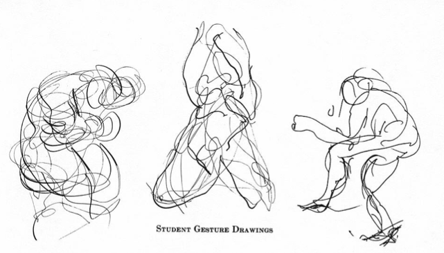
I can’t get a quick, even somewhat accurate drawing in less than a minute--but I can draw a loose set of lines and scribbles that represent the movement of the figure. So can you ;-)


The tricky thing about gesture drawing is that we’re adding another dimension--which we have been doing with each exercise. Negative space drawings are pretty two dimensional, even when drawing from life. With blind contour drawings we start to think about three dimensions, but with Modeled drawings we really push that idea further and are really focusing on how a form occupies space. Gesture drawings focus on movement. Movement has to happen over time. So, in our flat unmoving drawing, we are trying to get across the idea of this four-dimensional event.


The other tricky thing about gesture drawing is that we all (including me) get caught up in the idea that drawings ought to look like someTHING. We can argue about whether a gesture is a “thing”, (it is certainly a noun, but isn’t a person or place--so is it a thing, or an idea?) but while it is done by something solid, the gesture itself is not. But even though it isn’t solid, and arguably isn’t a “thing”, you can still draw it. (One of these days I’m going to do my whole spiel on how abstract and representational art are more closely related than most people think. But not today.)


Exercise: Gesture Drawings

Goal/Focus: seeing movement, making quick decisions, sketching on-the-go

Materials: Sketchbook and pen or pencil

Assignment: Every day, spend at least 20 minutes doing gesture drawings. These should be quick, no longer than 2 minutes apiece. Draw impressions of the movement of people or animals or things. Focus on ACTION, not edges or details. Think through the action as you draw it--what came before, what will come next? It may help to think of an attitude or feeling--tired, happy, angry, scared, etc. Choose curved or straight lines depending on the action.

AT LEAST once (but hopefully more), go to a park, playground, sports game, dance class, pool, zoo, or mall, (anywhere people or animals are moving in fast, dynamic poses) to draw from life. Other days you can use photos, figure drawing websites (just search gesture drawing or figure drawing. Here is one I have used, but there are others.)

Have fun!
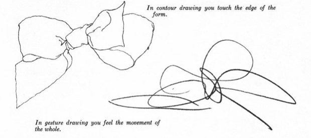

Picture
0 Comments

Book Cover Fanart--the Last Unicorn

9/25/2015

0 Comments

 
So I'm posting AGAIN this week. I'll never be able to keep this rate of posting up, but I just have this awesome new toy that I am trying out. I finished the Lonely Dragon comic on my shiny new Tablet Monitor (much more quickly than I would have with my tablet), and then Experimented in Photoshop with my Rockwell master copy. Time to head back to my program of choice, doing my favorite kind of art--fanart. (Because really, fan art was the reason I got into illustration in the first place.)

The Last Unicorn has been on my TBR list for quite awhile, but it was only a couple weeks ago that I decided to really buckle down and read it. Since this is not a book review I won’t get into what I liked and didn’t like about it, I’ll just say this: one of the things I really liked about it was the very strong imagery. I’m an illustrator, we like things that make great images. So of course after reading any book with great imagery, my immediate first reaction is to create fanart.

I decided on creating my own book cover, so I did put some text on it. I’m no graphic designer though, so the text isn’t really my strong suit. (You’ll see in the progress photos that I changed my mind about the font halfway through.)

When this image was in my head, I felt really strongly that the outlines of the Red Bull needed to be yellow. I did not, however, want the outlines of anything ELSE to be yellow. Since I have never used more than one outline color for any of my linework-based illustrations, this piece was highly experimental in that way.

Compositionally, I wanted the image to be able to work without text, but still have the most important stuff going on within a kind of square that the text wouldn’t have to cover up. I think this worked out pretty well.
Picture
I tried my best to put text on there in a readable and attractive way, but, as I said, I'm no graphic designer.
Picture
I'm pretty happy with how it came out. I learned a lot on this piece, and tried a lot of new things.
0 Comments

New Hardware and a Master Copy

9/24/2015

1 Comment


I almost finished writing this whole post, and then the internet ATE it. And I’m not sure I want to write it all out again. Gah. Well, I can simplify.

First, the exciting news--I have a new Yiynova MVP22U(V2) Tablet Monitor. For you non digital artist people, that means that I have a special screen and pen that lets me draw directly on the screen, so it is much closer to the experience of actually drawing or painting traditionally than using a mouse or tablet.

This purchase was a long time in coming. We’ve been talking about getting a larger monitor for me to use with my laptop for over a year. I’ve been using my cheapo off brand drawing tablet for many years, and it has never been the perfect drawing tool, but as a student it was what I could afford and it was good enough. So, I could get a separate monitor AND a tablet, or for just a little more, I could get the super cool combined version that would also take up less room things AND let me work faster.


So, we decided on a tablet monitor.

It arrived last Friday night. I couldn’t wait to get it set up and put it through it’s paces. There was a small issue with the drivers at first, but the distributors were extremely prompt about helping me fix it, and then I was good to go.

Next big decision: What should I do for my first project on my fancy new toy?

I decided to do something I hadn’t ever felt confident in on my old tablet--painting in Photoshop. I’ve always been an Illustrator girl, and a big part of that has been because I never felt like I was able to draw well using a drawing tablet. However, I'd done OK on tablet monitors in my digital painting classes. Time to see if it really made as big a difference as I remembered.

I decided to do a Master Copy of a traditional painting in Photoshop, since I’ve been collecting pictures of awesome portrait paintings on Pinterest for AGES. (Pinterest isn’t just for recipes, crafts, and stylish outfit ideas. Artists figured out a long time ago that it is one of the easiest ways to collect and organize awesome pictures you find on the internet. Which I guess is what everyone else does with it anyway, but they don’t really think of it in those terms.)

So, a Master Copy. I gave myself some rules before diving in. 

I wanted my process to imitate oil painting as closely as possible. So, no layers--everything was done on the base canvas layer.

Also, I did not do any color picking from my reference picture, I only picked colors I had already laid down on my own copy. My thinking was that my canvas could represent the “palette” of colors that I had already mixed, while the reference photo was just that--my reference. This was also just a good exercise in color matching using the Photoshop color tools, which I am NOT perfect at, so you will notice some color differences between the two.

Third, I used brushes with over 70% opacity for the initial 70% of the painting, and then used less opaque brushes or blending tools later. To me, this was like laying down paints on a blank canvas to start, and then painting into wet paints later in the process.

I also did not zoom in for the first 70% or so of the painting. This is kind of an indirect correlation, but to me this was like using big brushes to get in the main details in the beginning, and only moving on to smaller brushes to get the little details in the end.

Lastly, I tried to match the textures as well as I could, but since I’m relatively inexperienced in Photoshop there was a lot of learning and experimenting with the brushes to try and achieve this, and I still have a lot of work to do there. This is what I felt was least successful in my piece.

I started this on Saturday and have spent at least a couple hours on it every day (except Sunday) since then. It isn't perfect but I've spent many hours starting at it, and I think I learned what I wanted to learn from doing the project, so I'm calling it done.

It won't be hard to notice differences between the two, just so you know. I'm not THAT amazing at this. Photoshop is still a nuisance to me a lot of the time. But it was good to get out of my comfort zone a little with this piece.


So here it is. Which is the original and which is the copy?

Picture
Here is a closer look at my version. It doesn't look quite as bad when you don't hold it next to the original :-).
Picture
1 Comment

the Lonely Dragon

9/22/2015

0 Comments

 
For awhile I've had the idea in the back of my head that I wanted to do a one-page comic, which seemed a very do-able length. What kind of story could I tell in only one page, though? I thought about it for a few weeks, looking for something interesting but concise.

Then one day while I was sketching, I thought, I'll make a comic about a dragon. A lonely dragon. Why was he lonely?

This was my answer.

Picture
I'm pretty happy with how it turned out. There are couple little things I see on it that aren't perfect, but I'm not even sure how to fix them at this point (I've been looking at it too long). So, its finished--not perfect, but It is what it is and I am satisfied.

The intention was to have it look like it was made entirely as a linocut made with 4 color layers: Black (well, dark purple), gold, grey-green, and red. As I made it it kept reminding me really strongly of the comic Digger by Ursula Vernon, though I did not specifically intend to emulate her style. I don't know much about her process, but I think it was probably something similar to what I used here.
0 Comments

Inktober Prompts 

9/21/2015

24 Comments

 
Picture
September is drawing to a close! Which means that October is right around the corner. Its time to get ready for Inktober!

If you don't know what Inktober is, take a look at this page: http://mrjakeparker.com/inktober

For the first time, I'm planning to do the full out, one drawing per day Inktober challenge. And to do that, I'm asking all my friends to help me out.

A few months ago, I asked for sketching prompts from all my Facebook friends and had a lot of fun with it. So, I've decided to do that again for Inktober. Here is how it will work:

Leave me a prompt in the comments to this post. Number your prompts in the order they are left--The first person to leave a prompt will number theirs with a 1, the second will use a 2, etc--that way it will be easier to keep track of how many there are. Please just leave ONE prompt. Try to keep it less than 5 words--you are not describing an illustration in detail, you are merely providing the idea that will spark my illustration.

If the 31 slots fill up before you get to leave your prompt, then you can leave one anyway and I may end up getting to it. If the 31 slots don't all get filled, then I will fill in the extra days with things I choose to draw.

Ready.... GO!
24 Comments

Inside Out Thinking

9/21/2015

0 Comments

 
So, who did some blind contour drawings last week? Me! I did! If was fun and hard and weird. Looking at what you are drawing is such a natural thing to do, it is hard to force yourself to look away. However, I really did feel that it helped me to focus on just looking, and not even worrying about whether my drawing looked nice, which is a good thing. I did struggle to spend long enough on my drawings, so I've edited the assignment from what it was originally so they only need to take 10-15 minutes rather than 20. I did almost make it to 20 with the most complex object I chose to draw, but the others just didn't take as long. Maybe I just have a hard time moving slowly.

There is kind of a charm to blind contour drawings, despite their weirdness. Maybe its just me, but I think they look kind of interesting.
Picture
Picture
Picture
Picture
Picture
Picture
I believe that, in order to learn to draw well, you need to learn to look at things and think about what you see differently from those who haven't yet learned to draw. (I won't say people can't draw. They can if they choose to learn.) In the first exercise, we thought of the spaces where an object is NOT as the actual subject of our drawings. With blind contour drawings, we learned to really stop and look at an object and take the time to see how the edges really interact with each other, how one leads to another. Both of these exercises focused on edges--where one object ends and another begins.

Well, this week we are going to do something different. If drawing is about learning to see things differently, there must be many different ways to look at things. So this week, rather than focusing on edges, we will focus on the actual physical form.

This weeks exercise is adapted from the exercise on Modeled Drawings from Nicolaides' book The Natural Way to Draw (remember him from last week?) This is how it works: If, for example I were drawing a person, I would look at the whole form and try to decide where the very center of the entire three dimensional form is--not just the center point between two edges, but the core of the entire form. I would place my crayon (not a pencil or pen this time) on my paper where I would want this center point to be on my page. Then, without pressing hard and using a roundish wandering scribbling line, I would build up the entire form from that center point, imagining I was building it up out of clay as I add layers of scribbles. I would Imagine I was building a model of clay--thus the name, modeled drawing. 

Once I had the entire form built, I would pay special attention to how the form turns--which parts are closest to me and which are further away. I would go over the form again, pressing very lightly where the form is closest to me, and pressing harder and harder as the form turns away from me. Again, I would be focusing on the actual form of my subject and how it turns, how it would feel if I were making it with clay. The result would be a drawing that seems to have some dimensionality, not because we have drawn the lights and shadows, but because we have consciously represented the form and how it occupies space.

So, what is the point?

Out of all the figure drawing classes I took as an art student, only one of my teachers had us do an exercise like this. At the time I didn't entirely understand it--maybe because it wasn't well explained, or maybe because I, like many people who learn to draw with narrow pencil and pen lines, was hooked on edges. It was in my head painting class that I really began to understand the importance of starting out by building your entire shape before defining the specifics of the form. It is my personal opinion that we use pencils and pens to learn to draw, not because they are actually the easiest tools to help us learn all the concepts, but because they are simple and familiar and don't make a mess, like paints and charcoal and chalk pastels, etc. do. Their drawback is that, with their small points that draw little details so well, when we use them we are too easily pulled into the details and specific little nit-picky things rather than getting the overall form down first. As my high school art teacher said about 50 times a day: work from General to Specific. General to Specific. General to Specific.

Its a common joke among artists that you can spend all your time drawing one eye (or hand, or other part of a thing) and then when it comes time to draw the other eye (or the rest of the body, or whatever) you find you can't get it to look right, or that you put it in the wrong place. One way to combat this "one-eye syndrome" is to force yourself to stay away from details until the entire form is working. After you know you have everything in the right place, you can draw the eyelashes.

And thats just one thing this week's exercise can help us with. I haven't even gotten to how it is important to think about how an object turns and occupies space, but I think I'll talk about that with one of the following exercises.

Time for homework.

Exercise: Modeled Drawings

Goal/Focus: Seeing the entire form before getting into details, understanding how a form turns and occupies space

Materials: Sketchbook, crayons (charcoal, conte crayon, or chalk pastels are also good for this exercise, but not everyone has those lying around.)

Assignment: Spend 20-30 minutes a day doing modeled drawings, 2 each day (10-15 min each). Do these drawings from life, not photographs. (This should be a given by now, but I'll probably keep saying it.) Starting in the middle of the form, scribble your way out to fill in the entire shape. Then (using a second, darker crayon if you want--though you can do the entire drawing with one crayon if that works) model your form by pushing harder in the places where the form turns away from you and drawing very lightly where it is close.

Because of the way this exercise works, it can be easier to do this with softer, more organic shapes. However, if you want to do it with more geometric shapes go ahead, but remember--we are NOT focusing on edges this week. You'll naturally end up with edges by filling in the form, but they aren't what you are focusing on.

Some ides for subjects:
People and animals are ideal for this. See if you can catch a friend or pet while they're sleeping.
Soft couches or chairs, or other furniture (a toilet would actually work really well, if you don't feel too weird about drawing it)
Wrinkled fabric--a towel or coat hung on a peg, a blanket dropped on the floor
Trees (though we're getting into the season where they lose a lot of their form--get to them while they still have leaves!)
Clouds (work fast!)

As with previous exercises, these are just ideas and you should not feel limited to these subjects. If you see something that looks really interesting to draw, go for it. Have fun!


0 Comments

Having the Patience to Pay Attention

9/14/2015

0 Comments

 
I know I said that I would post my pictures of the exercises on Friday, but... I didn't. I'm posting them on Monday. Which I think might actually work better for me, so I'll probably stick with this. We can go over the principles of last week before diving into some new ones. (Maybe I should say "I", since I'm likely the only one reading and doing these exercises, but I enjoy pretending that you are there, because you are pretty great. :-)

So, last week we did Negative Space drawings! I have an admission to make: I only got 4 of the 5 drawings done. So I get like a B- or something like that. But we're not grading this, so I guess I just get 4 drawings worth of learning instead of 5.

Unlike last week's, I have decided to show my drawings here, but let me preface it first with this: while negative spaces were the focus, I found myself using many other drawing techniques I've learned to get these drawings to be (more or less) accurate. If your negative space drawings are less accurate than these, that is more than OK. Here and elsewhere on the internet there are other exercises and drawing techniques that can help you.

If, however, your drawings are already more accurate than mine, well, good job! Why are you here again? Oh yes--nobody is too good for the basics.
Picture

Picture
Picture

Picture

So, how did you do? If you actually did it, then that is wonderful in and of itself. If you feel like you can now draw better than before as a result of the exercise, that is even better. It was helpful for me too, and it wasn't new to me at all.

You may notice when looking at my drawings, and maybe your own, that these are not nice, pretty drawings which you would want to hang on your wall. They look like what they are--learning exercises. Most of the drawings you will produce from the exercises I outline will probably look the same. Today's exercise, which is inspired by one outlined by Kimon Nicolaides in his book The Natural Way to Draw, will probably be the same. That is OK. On this topic Nicolaides said,
Picture
Picture
So I'm showing you the drawings I did as an exercise, but I do not expect you to do so as well if you feel self conscious about it. If people ask to look through your sketchbook and you feel uncomfortable about it, it is OK not to let them. If, however, you are OK with showing people your work, go ahead. Do what you are comfortable with--as far as showing your sketchbook goes, that is. I do hope, however, that some of these exercises are a little uncomfortable to do, because they are meant to help you to look and think in a new way--that is what drawing really is. And it isn't always comfortable.

That is why I don't like one of the more popular types of drawing books. I'm talking about they type where it shows you how to draw an animal by starting with a structure of basic shapes and then breaking them down and adding details. The principle isn't exactly a bad one, as far as it goes, because that is one good method of drawing something. The problem is, it doesn't teach you how to do it--it does it for you. Some people are able to figure out the principle from using the book, but most (in my experience) are not--which is why this picture I've seen floating around various social media sites is funny. To most people, this is what the books actually look like--they outline what seems to be a simple framework, then throw on all the details without actually teaching anyone how they arrived at the final result.

Unsurprisingly, people get frustrated with this type of instruction and conclude that they can't draw. I believe the problem here is two fold. One, the book does most of the work for the student, without explaining the principles used. Because of this they become dependent on the book, and can't produce any drawing that isn't broken down for them. Two, the whole idea of the book is based on the premise you don't need to work hard and produce some ugly exercise drawings before you produce a masterpiece--if you just follow the step by step instructions, you will have a beautiful drawing to hang on your wall!

Sorry, friends. It just doesn't work that way. As our friend up-post, Kimon Nicolades said,

Picture

Hmm, you're saying. You seem to be foreshadowing something here. I seem to be getting the impression that the next exercise will produce ugly drawings that I will want to hide from every living soul.

Well, that may be true. But the principle is that you will come out of this with that much more of an understanding of how things actually look. You ultimately will be able to break down what you see into manageable parts, without even needing a book to do it for you. That is what we are aiming for.

So what is this weeks exercise, you ask?

This week, we are doing Blind Contour Drawings. These are pretty fun. Be excited.

I first read about blind contour drawings in Drawing on the Right Side of the Brain, but Betty Edwards got the idea from--you guessed it--our friend Kimon Nicolaides, in his book The Natural Way to Draw. Though they both use this exercise, they have different ways of explaining how to do the exercise and different explanations about why it is helpful. I will attempt to summarize their ideas, as well as offering a few of my own.

First, a summary of the exercise. What exactly is a Blind Contour Drawing? We all know what "blind" means--not being able to see. But what is a contour? A contour is an edge or an outline. We worked with edges last week in our negative space drawings. Here, we will focus on more than just where one object ends and the next begins. For our contour drawings we will also include corners and wrinkles. Not shadows or colors--just contours. Outlines. Edges.

With those definitions, have you figured out what a Blind Contour Drawing is? It is a drawing where you draw the outline of your subject without looking at your paper. You focus completely on following the outlines and edges of the subject with your eyes while simultaneously drawing them--without looking away, even to check your drawing. You keep your pencil on the page, because if you lift it off you can't look back at the drawing in order to put it back in the right place.

(In some versions of the exercise you are allowed to lift the pencil and look back at your drawing periodically. But we're not doing it that way. We're going all the way!)

So, what is the point?

For Nicolaides, a big part of this exercise is the conviction that your pencil is actually touching the thing that you are drawing--that you are pulling your pencil along the outlines of your actual subject. This essential to his definition of a contour--it is something you can actually feel, even if you are blind, as opposed to things you can only see, like a shadow or a color. If you are able to convince yourself that you actually feel what you are drawing, you will have a much more complete experience of that thing and what it actually looks like.

For Betty Edwards, the important thing about this exercise (as with most of the exercises in her book) is the switch from Left brain to Right brain thinking. For Edwards, the left brain is satisfied to label something as, for example, a hand, and move on. When you stare at the hand and draw all the little details of it--the edges, the wrinkles, the outlines--the Left brain bows out and lets the Right brain do it's thing.

(Since the publishing of Drawing on the Right Side of the Brain Psychologists have done more studies and now believe that the separation between Right and Left brain isn't as distinct as it was once supposed. However, I believe that for learning to draw it can be useful to think of that separation between types of thought, so I don't take issue with it as far as it goes. We're here to draw, not psycho-analyze ourselves.)

So that is what Nicolaides and Edwards think of this exercise. But since this is my blog, I get to have an opinion too, limited though my experience may be compared to theirs. In addition to their ideas, I believe this exercise is about focus and patience. A blind contour drawing, according to both of them, must not be done quickly, but rather meticulously. Do we have the patience to look, really look, at one thing for 20 or 30 minutes? Do we have the patience to look at one stationary thing for even longer than that? I think I have less patience of this sort of thing than I did a couple of years ago. Having the patience to really look at something is essential to drawing well.

To me, this exercise is about focusing. Its about the experience of really, deeply seeing what you are looking at. The drawing you produce is simply evidence of that experience, it is not the actual purpose of the exercise.


Are you ready for the homework?

Exercise: Blind Contour Drawings

Goal/Focus: Learning to Focus, developing patience, understanding of how things really look

Materials: Sketchbook, pen or pencil

Assignment: For at least 20-30 minutes a day (M-F), do two blind contour drawings (10-15 minutes each). Do these drawings from life, not photographs. Choose a subject that is complex enough to spend 15 minutes staring at. Do not lift your pencil from the paper, and do not look at your paper until at least 10 minutes have passed and your drawing is finished. If it takes more than 15 minutes, that is a GOOD thing. That means you are really slowing down--speed is the opposite of what we are going for here.

You can use similar subjects to those you used for negative space drawings, if you want, or you can find new subjects to draw. A few ideas:

Your hand or your foot
a wrinkled piece of paper or fabric
A person or face
Flowers, plants, or trees
Grouped things you have around the house--a cup holding pencils, a pile of magazines, a bowl of fruit, the contents of a drawer.

Don't limit yourself to these ideas--draw what you want. If you find yourself drawing too quickly, try putting the pencil in the hand you don't normally use to draw--that will slow you down. Your lines might be more wobbly, but this isn't about making a nice drawing anyway.

Remember: you aren't trying to draw quickly. you are learning to observe deeply.

Have fun!

0 Comments

Self Portrait... in Photoshop

9/9/2015

1 Comment

 
I guess I caught the Photoshop bug or something. Well, not really. I was wishing almost the whole time I was painting this that I was using oil paint instead. Well, except for when I could just nudge or liquefy things into the right place without having to re-draw them. I like using Photoshop at those moments. But all of the other moments, I was really missing the smell of turpentine. No joke.

But, this was really fun to do. It made me think of my head painting class, which I loved. Maybe I'll bust out that old painting box after this--I have a feeling that this is an itch I'll need to scratch.
1 Comment

Playing around with photoshop

9/8/2015

0 Comments

 
I make no secret of the fact that I'm a vector artist. Every piece in my portfolio--every single one of them--is a pure vector image, including the textures. I create this way because its what makes sense to me. I was introduced to Illustrator and Photoshop at basically the same time, in the same Intro to Digital Illustration class. I enjoyed Illustrator much more than I did Photoshop, and so I just used it more often. A whole lot more. I can poke my way around Photoshop and create some basic stuff, but Illustrator is my digital art home.

Every once in awhile, however, I see an awesome piece created in Photoshop and think, wow, I should really figure out this whole digital painting thing. Vectors are great, but they just can't do everything.

One of the things holding me back were the brushes. I know, I know--there are some really awesome paintings that have been created with the basic Photoshop brushes. But I just dislike the texture of those brushes SO MUCH that it has kept me from sticking with any painting in Photoshop.

Recently I asked a friend about what brushes she uses in Photoshop, and she said she's been using this brush set a lot lately. I downloaded them and--wow. There are some great brushes here! I did a whole value sketch from imagination using them, and actually enjoyed it and didn't hate the texture or feel of the brush. It isn't a portfolio quality piece, and there are some things I still need to figure out, but I painted in Photoshop and liked it. This is huge, people. I don't think I'll ever convert all the way over to Photoshop--infinite enlargability is something I've become very used to--but it will be nice to have it as an option.


Picture
0 Comments

Seeing what isn't there

9/7/2015

0 Comments

 
Happy Labor Day! Last week, I started a project I've been thinking about for awhile now. Each Monday, I'll be posting on my blog a basic drawing exercise that can help you to learn to see and draw more accurately. On Friday, I'll post pictures of the sketches I made.

Last week's assignment was on pre-instruction drawings. I won't be posting mine here for a couple of reasons--if they were here, I would look back at them (I probably look at my blog more than anybody else), and part of the fun of doing pre-instruction drawings is being surprised at your progress when you look back at them after weeks of work. Second, since I have already had a LOT of art instruction, I don't think it would be fair to show mine as examples of what a real drawing done before any art instruction would look like. I think I may post them at the end of this series, though, to see if I made any progress through doing these exercises.

I want to introduce the exercise by doing a sort of "in class" activity. I'm going to intentionally leave spaces you'll have to scroll past to see the final "solution".

Am I being vague enough?

I did this activity with a group of twelve year old girls last week, and it took about 45 minutes start to finish--so do this when you have a little chunk of time and don't rush through it.

To start this activity, print out these three pages. They need to be in proportion for the activity to work, so don't fiddle around with the printing size options (or if you do, do it the same for all three.)
Picture

Page one: print this out, and then cut out each of the black pieces. You don't have to be too exact about this--it's fine if you leave a little bit of white around the edge of each piece, just don't cut off any of the black.
puzzlepieces.jpg
File Size: 78 kb
File Type: jpg
Download File

Picture


This next one looks pretty boring, but it is actually really important. Its just a rectangle, but this is the rectangle that your puzzle is going to fit into.
puzzleframe.jpg
File Size: 10 kb
File Type: jpg
Download File

Picture


Whats the last thing we need for a puzzle? Oh yes--we need to know what it is supposed to look like! Here is your reference picture. You may be able to assemble the puzzle without printing this one out, but it can actually be really helpful to have a physical copy of this one to look at.
puzzlepicture.jpg
File Size: 129 kb
File Type: jpg
Download File

Now you have all you need to do this activity. You know its a puzzle, you have your pieces, your frame, and your reference picture. Ready.... Go.


You probably figured out by now that this is not a jigsaw puzzle. What kind of puzzle IS it? That is for you to figure out. Some people see the solution quicker than others. If you're feeling stuck, here are a few hints. I'll make the text white so you have to highlight it to see it.


1. Start with the corners.

2. None of the black pieces will touch each other.

3. See if you can line up a black piece with one of the white spaces in the chair picture. Then, place it in that same place in your frame.


Think you've got it?


Here is the solution:


Picture
puzzlesolution.jpg
File Size: 77 kb
File Type: jpg
Download File

I call this a Negative Space puzzle. I got the idea for it by combining a couple of activities suggested in Betty Edward's book Drawing on the Right Side of the Brain, though this specific activity is my own way of showing the concept.

And what concept is that, exactly? And how does a puzzle help me learn to draw?

We're getting to that. Actually, it's the next part of the activity.

I want to take your puzzle pieces off of your puzzle frame. Place your frame and your reference picture side by side. Now, using the picture of the chair as reference, draw where each of the puzzle pieces should be. DO NOT think to yourself, "I am drawing a chair." Instead, think, "I am drawing those puzzle pieces." Think of those empty pieces as the actual physical thing you are drawing--think of the real puzzle piece that you held in your hand. That is what you are drawing. To keep yourself thinking about the pieces instead of the chair, it can help you to turn your picture upside-down and draw it that way. Something else that might help you think this way is to color in the puzzle piece spaces, and leave the chair space blank.

Ready, go.


How does it look? Many people who are introduced to this concept for the first time are surprised at how much more accurate their drawings are. How can such an odd way of thinking make your drawing more accurate? It seems like thinking about the chair should make your drawing look more like a chair, but that isn't how it works.

Before we learn to draw, we often think in symbols. Symbols such as these:

Picture
The thing is, nobody's eye is actually a football shape with a circle in the middle. Nobody's house is a square with a triangle on top. There isn't a tree that is actually a puff ball with a pole holding it up. These are simplified shapes that represent the idea of the thing, but they aren't what these things actually, realistically look like.

Don't get me wrong, these symbols can be useful--but not when you want to learn to actually understand what you see and draw it accurately. To do that, you have to move past the symbol and see what you are actually drawing. You need to stop thinking "chair" and start thinking "a group of specific abstract shapes".

By focusing on where the chair isn't--the negative spaces, our puzzle pieces--we see more accurately what shape the chair itself takes, rather than simplifying it into a symbol.

Exercise: Negative Space Drawing

Goal/Focus: Drawing accuracy, seeing past the symbol

Materials: Pencil, eraser, sketchbook

Assignment: For at least 20 minutes a day, draw in your sketchbook. Do these drawings from life. Draw the negative space around an object or group of objects. Some ideas of good subjects for negative space drawings might be:

Furniture, like a chair, table, or stool
Plants or trees
Stacks or groups of things--a stack of books, a bowl of fruit
Other somewhat complex objects with overlapping pieces--a bike, a lamp, a musical instrument

Don't limit yourself to these ideas--draw what you want. But as you draw, focus on drawing the spaces where your subject is NOT. Think of the empty spaces as being the actual subject you are drawing. Remember the puzzle pieces--think of them as an actual physical shape you can hold.

Have fun.


0 Comments
<<Previous

    Let me email you a Creativity Workbook full of fun drawing exercises:

    * indicates required
    Your email will not be shared with anyone. It will only be used for updates from me, and you can unsubscribe at any time.

    Want a Print?

    Take a look at my print shop on INPRNT.com

    Categories

    All
    Ambigrams
    Art
    Books
    Comic
    Craft
    Creativity
    Deep Thoughts
    Drawing Exercises
    Dummy Book
    Folding
    Goals
    Holiday
    Illustration
    Inktober
    Master Copy
    Painting
    Paper
    Personal
    Polyhedron
    Portrait
    Printable
    Progress Photos
    Snowflake
    Sourdough
    The Artist And The Engineer
    Whats Your Superpower?

    Archives

    September 2020
    March 2020
    January 2020
    December 2019
    July 2019
    June 2019
    March 2019
    February 2019
    January 2019
    October 2018
    September 2018
    August 2018
    June 2018
    May 2018
    April 2018
    March 2018
    December 2017
    November 2017
    September 2017
    August 2017
    June 2017
    April 2017
    February 2017
    January 2017
    December 2016
    November 2016
    October 2016
    May 2016
    April 2016
    March 2016
    February 2016
    December 2015
    November 2015
    October 2015
    September 2015
    August 2015
    July 2015
    June 2015
    May 2015
    April 2015
    March 2015
    February 2015
    January 2015
    December 2014
    November 2014

    RSS Feed

All content on this site was created by Sarah LuAnn Perkins. Do not use without permission.
Copyright © 2021
  • Portfolio
    • Picture Books
    • Book Covers
    • Middle Grade
      • Return of the Thief
      • A Kernel of Magic
      • Backpack Dragon
      • A Groundbreaking Journey
    • Comics
    • Maps
    • Stand-alone images and prints
    • Cricut Cartridges
  • Art Classes
    • Drawing Fundamentals
    • Beginning Painting
  • Prints
  • About Me
  • Contact
  • Blog
    • Dummy Worksheets